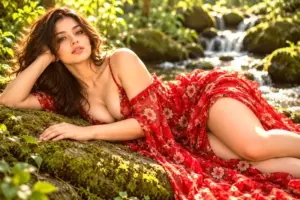
This page shows every Emotional Mood preset from the free Image Filters & Effects tool on its own: a before-and-after comparison and a full picture with the filter applied. There are 20 filters here, all run at 100% strength on the same sample photo.
Emotional Mood presets push a photo towards a feeling: calm, nostalgic, tense, hopeful. The changes are mostly colour and tone, so they work best on images with a clear subject. In this set of 20, 6 lean warm, 4 lean cool and 10 stay close to neutral. On average they change contrast by +13 and saturation by +4; 5 boost colour, 1 mute it heavily, 3 add visible grain and 9 add a noticeable vignette.
Jump to a filter
All 20 Emotional Mood filters
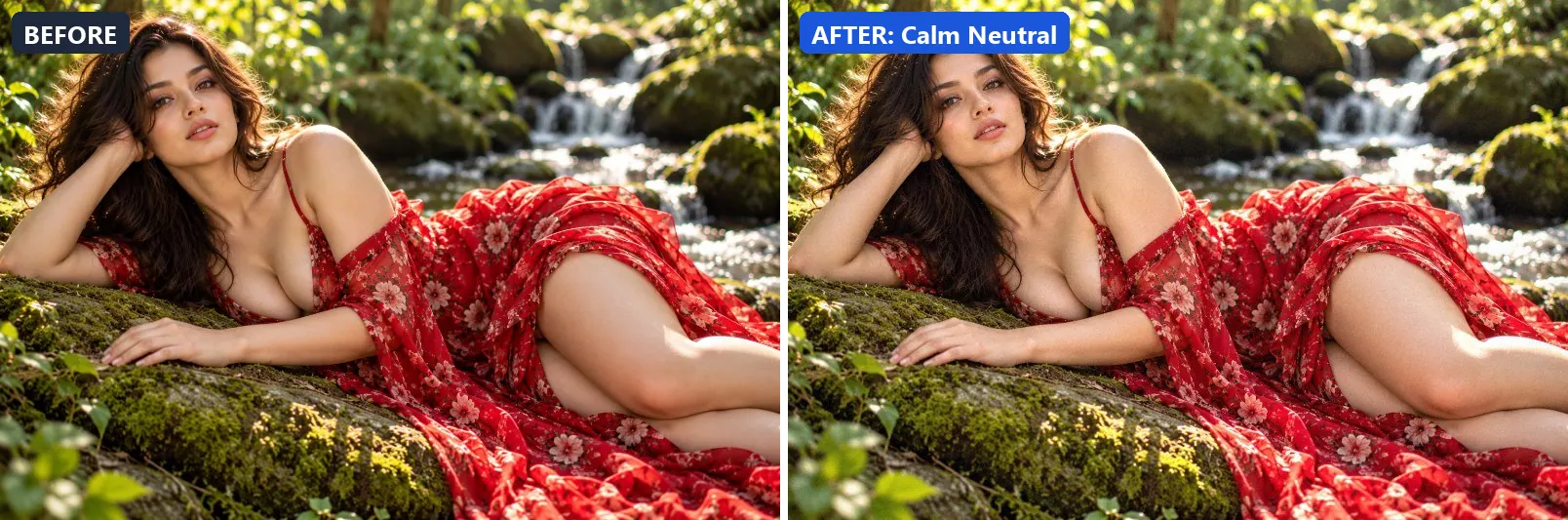
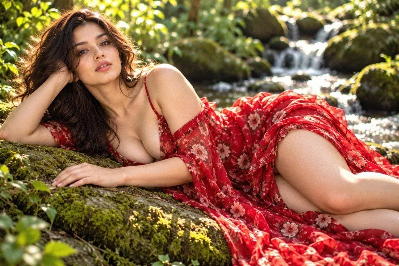
1. Calm Neutral
Peaceful calm — balanced, neutral tones, nothing to disturb the eye.
This preset lifts exposure slightly and gently lifts the midtones.
Brightness +6 · Contrast +6 · Saturation 0 · Gamma 1.05 · Warmth (R−B) −1 · Clarity +5 · Vignette 8 · Grain 3
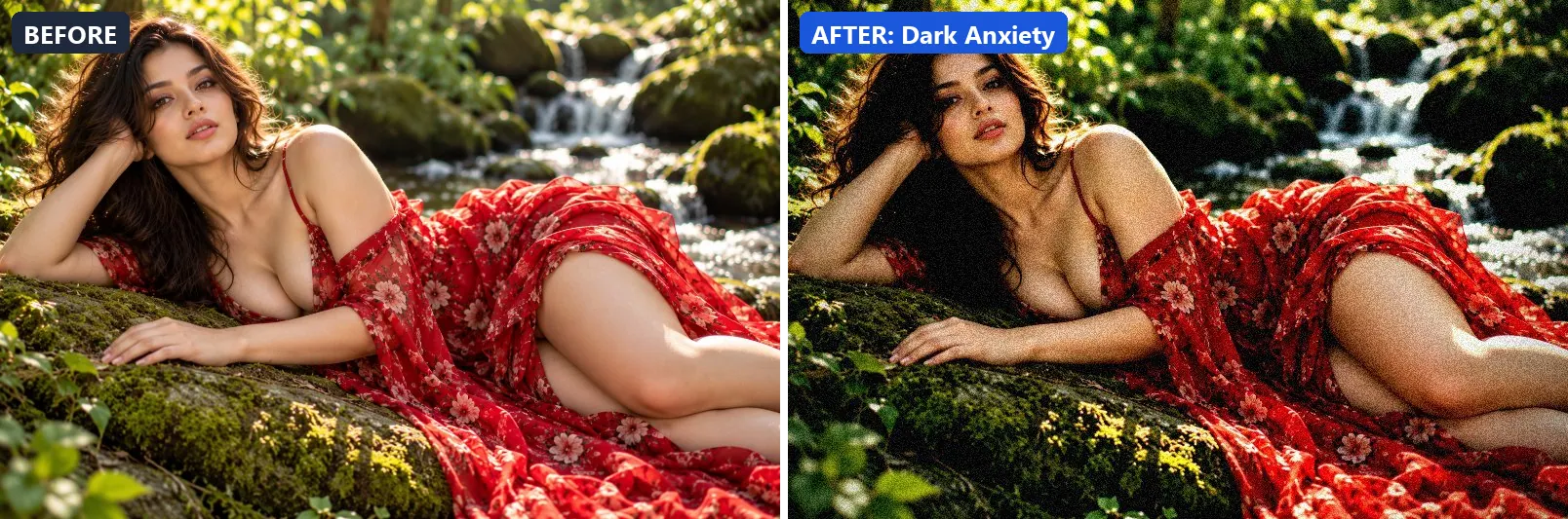
2. Dark Anxiety
Tense anxiety — deep shadows, high contrast, slight green sickness.
Applied at 100%, it leans cool, darkens the frame noticeably and deepens the midtones strongly. It also adds green-tinted shadows. Beyond that it adds strong contrast and applies extra clarity. It closes with a heavy vignette that darkens the edges and visible film grain.
Brightness −12 · Contrast +32 · Saturation −8 · Gamma 0.88 · Warmth (R−B) −10 · Clarity +8 · Vignette 58 · Grain 16 · Sharpen 1
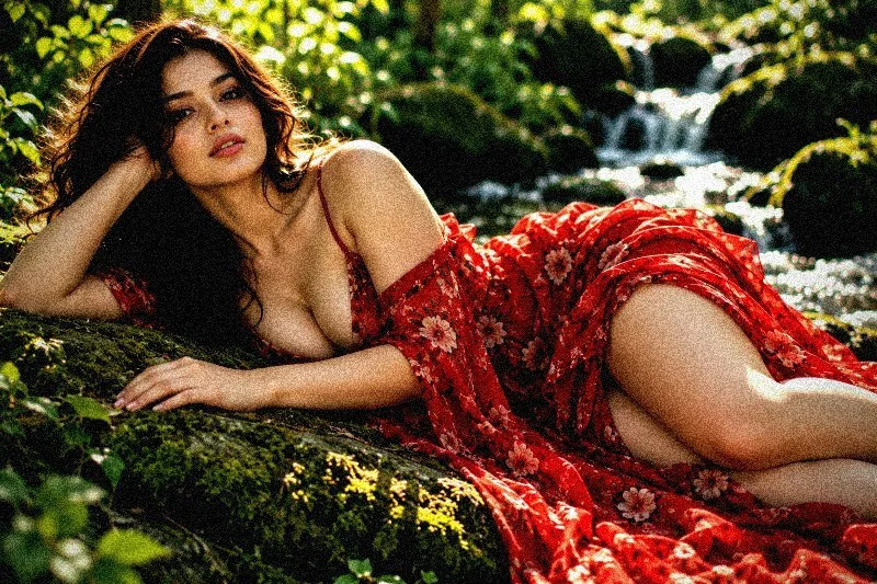
3. Dramatic Red
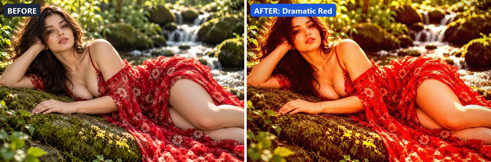
Passion and drama — warm reds dominate, deep contrast, intense emotion.
The grade boosts colour, adds a clearly warm, orange cast and adds strong contrast. Colour is split-toned with warm red-tinted shadows and warm golden highlights. In addition it applies extra clarity. Final touches: a noticeable vignette and a touch of grain.
Brightness +2 · Contrast +28 · Saturation +25 · Gamma 1 · Warmth (R−B) +46 · Clarity +12 · Vignette 40 · Grain 8 · Sharpen 1
4. Dreamy Soft
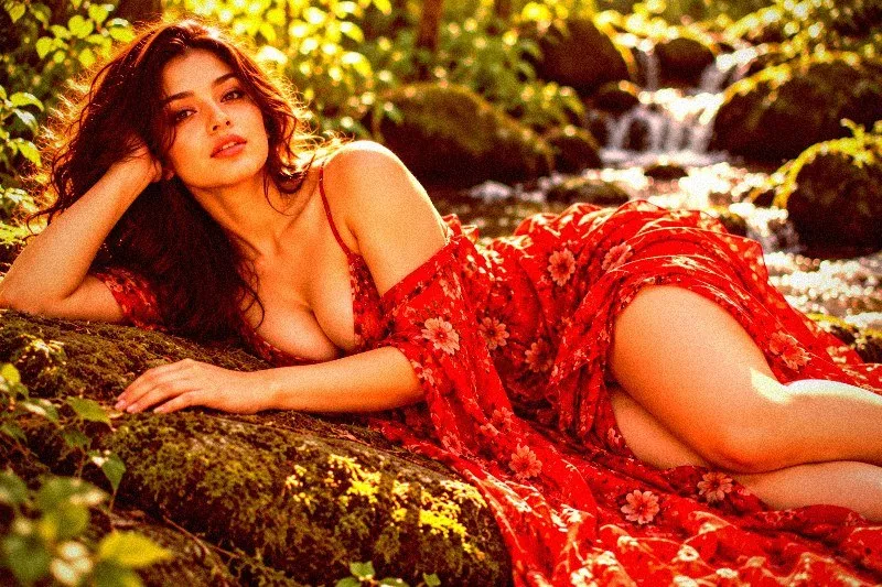
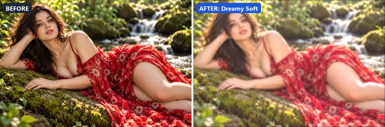
Wistful daydream — soft blur, pastel warmth, disconnected from reality.
At full strength it brightens the frame and opens up the midtones. The look is split-toned with warm red-tinted shadows and warm golden highlights. It also flattens contrast for a soft, faded feel and applies a soft blur of about 2 px for a dreamy look.
Brightness +14 · Contrast −14 · Saturation +8 · Gamma 1.22 · Warmth (R−B) +4 · Clarity −8 · Vignette 6 · Grain 3 · Blur 2
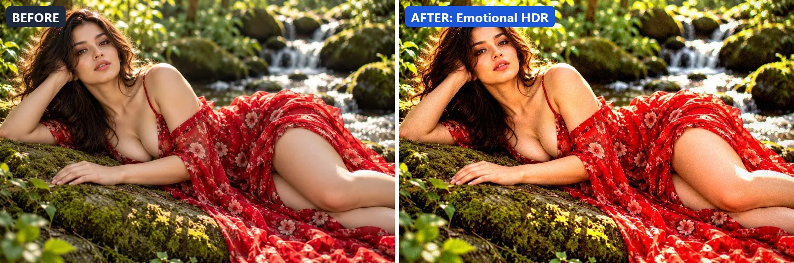
5. Emotional HDR
Hyper-real emotional impact — HDR tones that amplify every feeling.
This preset boosts colour, lifts exposure slightly and adds strong contrast. On top of that it applies strong clarity for crisp local contrast. The look is finished with a light vignette and a touch of grain.
Brightness +5 · Contrast +28 · Saturation +22 · Gamma 1.03 · Warmth (R−B) +3 · Clarity +25 · Vignette 20 · Grain 5 · Sharpen 1
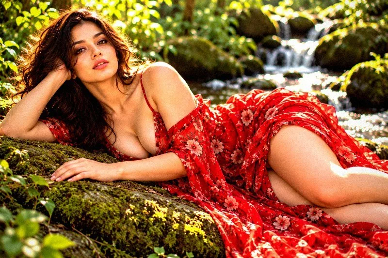
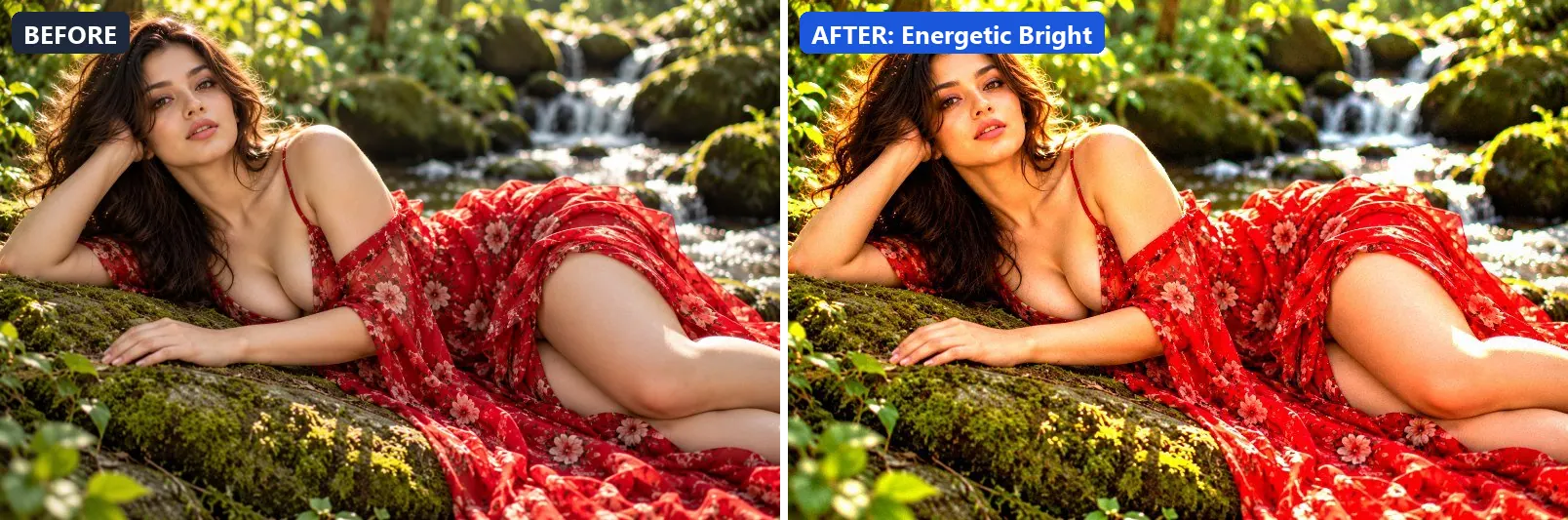
6. Energetic Bright
High energy and excitement — vivid, punchy, maximum life.
Applied at 100%, it pushes colour to a vivid level, brightens the frame and adds strong contrast. Beyond that it applies strong clarity for crisp local contrast and applies noticeable sharpening.
Brightness +10 · Contrast +22 · Saturation +38 · Gamma 1.02 · Warmth (R−B) 0 · Clarity +18 · Vignette 5 · Grain 3 · Sharpen 2
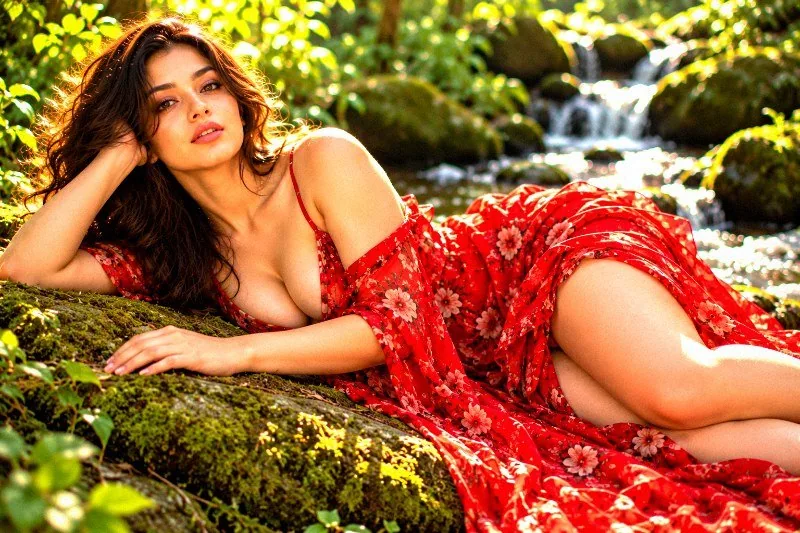
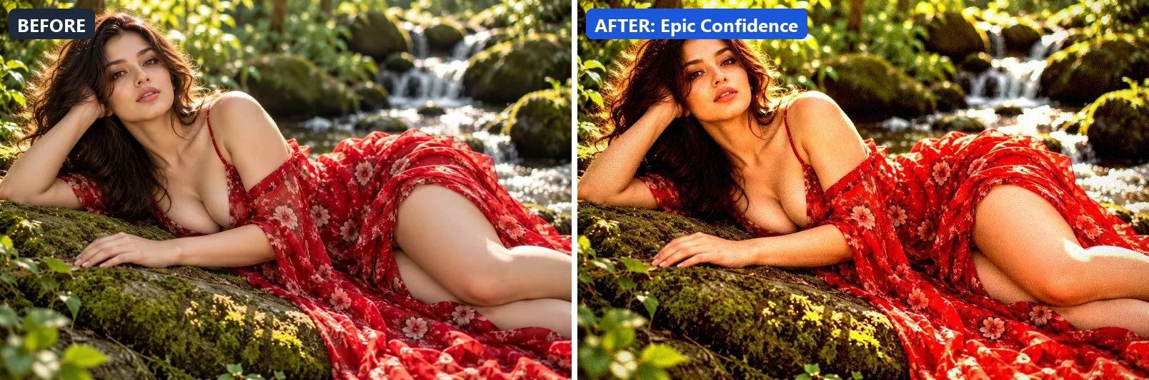
7. Epic Confidence
Bold confidence — strong contrast, warm power tones, commanding.
The grade adds a clearly warm, orange cast, lifts exposure slightly and adds strong contrast. Colour is split-toned with warm golden highlights. In addition it applies extra clarity and applies noticeable sharpening. Final touches: a noticeable vignette and a touch of grain.
Brightness +4 · Contrast +28 · Saturation +14 · Gamma 0.97 · Warmth (R−B) +17 · Clarity +14 · Vignette 30 · Grain 6 · Sharpen 2
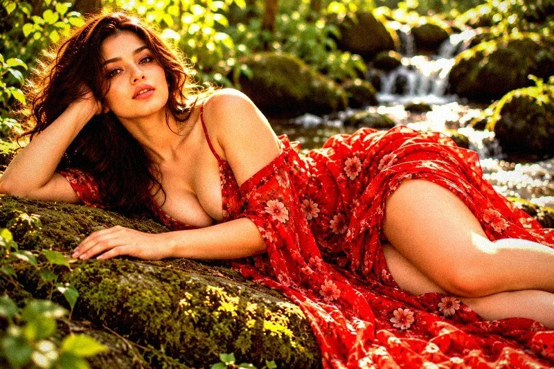
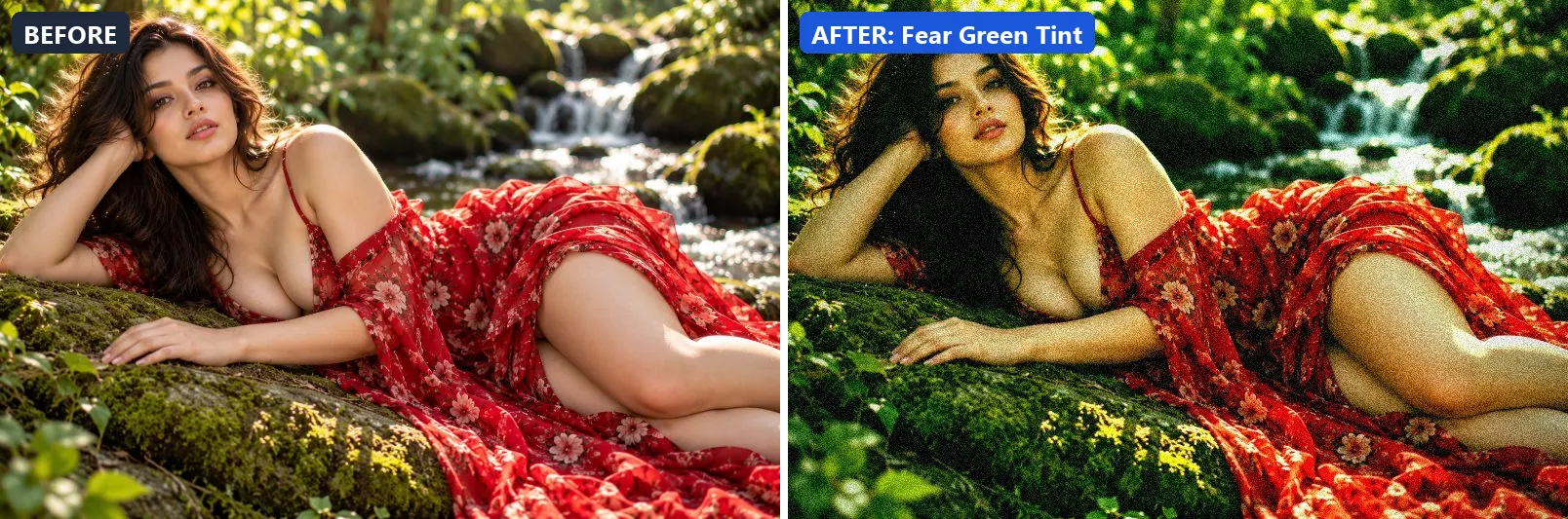
8. Fear Green Tint
Primal fear — sickly green, high contrast, queasy and unsettling.
At full strength it leans cool, pushes the greens, pulls exposure down a little and settles the midtones a bit darker. The look is split-toned with green-tinted shadows and greenish highlights. It also adds strong contrast. To finish, it adds a heavy vignette that darkens the edges and visible film grain.
Brightness −8 · Contrast +28 · Saturation +10 · Gamma 0.9 · Warmth (R−B) −9 · Clarity +5 · Vignette 52 · Grain 18 · Sharpen 1
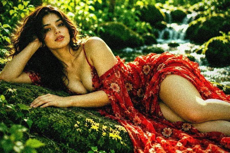
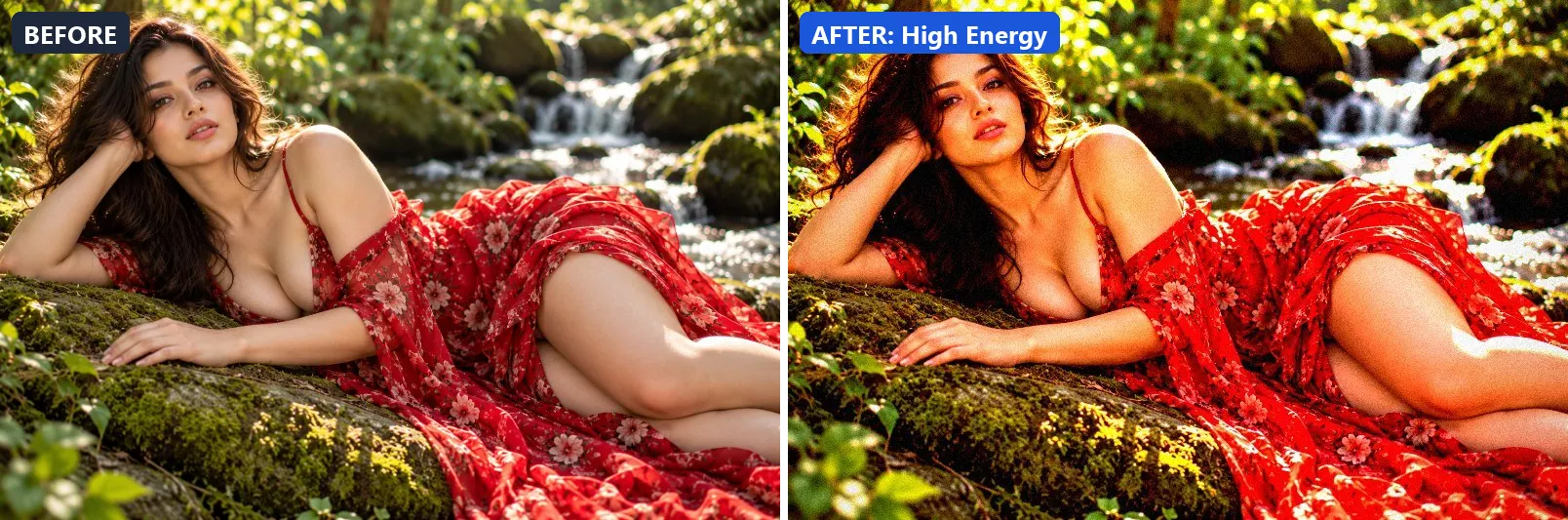
9. High Energy
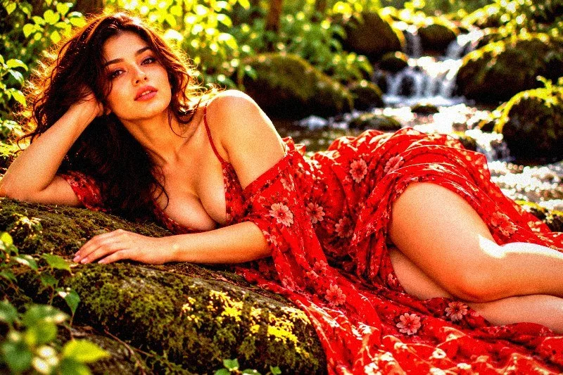
Pure adrenaline — overdriven saturation, extreme contrast, no limits.
This preset pushes colour to a vivid level, lifts exposure slightly and settles the midtones a bit darker. On top of that it adds very punchy contrast, applies strong clarity for crisp local contrast and applies noticeable sharpening. The look is finished with a light vignette and a touch of grain.
Brightness +5 · Contrast +35 · Saturation +42 · Gamma 0.95 · Warmth (R−B) +4 · Clarity +20 · Vignette 22 · Grain 8 · Sharpen 2
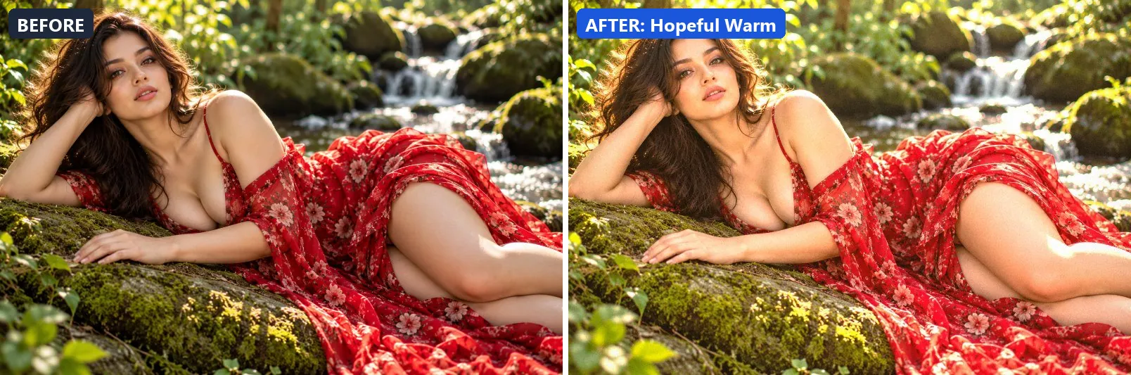
10. Hopeful Warm
Rising hope — warm light breaking through, lifted shadows, optimistic.
Applied at 100%, it leans warm, pushes the greens, brightens the frame and opens up the midtones. It also adds warm red-tinted shadows and warm golden highlights. Beyond that it adds some contrast and applies extra clarity.
Brightness +14 · Contrast +8 · Saturation +14 · Gamma 1.14 · Warmth (R−B) +13 · Clarity +8 · Vignette 8 · Grain 4
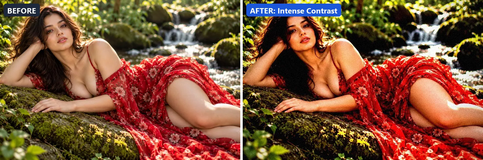
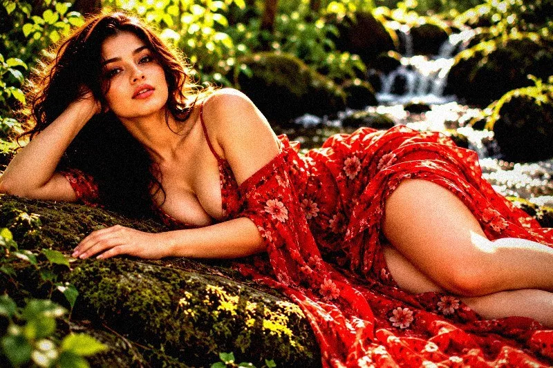
11. Intense Contrast
Raw emotional intensity — maximum contrast, no compromise.
The grade settles the midtones a bit darker and adds very punchy contrast. In addition it applies extra clarity and applies noticeable sharpening. Final touches: a noticeable vignette and a touch of grain.
Brightness 0 · Contrast +45 · Saturation +5 · Gamma 0.9 · Warmth (R−B) +3 · Clarity +16 · Vignette 40 · Grain 10 · Sharpen 2
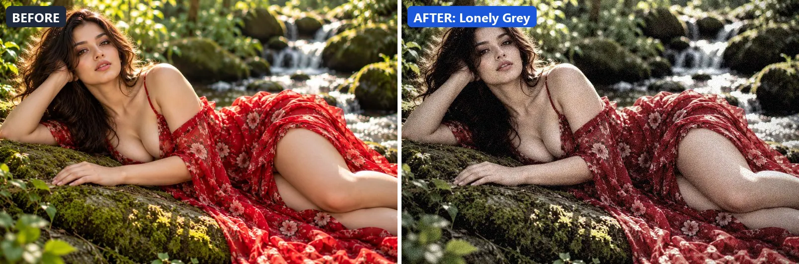
12. Lonely Grey
Quiet loneliness — deep desaturated grey with heavy vignette.
At full strength it mutes colour heavily, settles the midtones a bit darker and adds some contrast. To finish, it adds a heavy vignette that darkens the edges and a touch of grain.
Brightness −3 · Contrast +18 · Saturation −50 · Gamma 0.96 · Warmth (R−B) −5 · Clarity +5 · Vignette 48 · Grain 12
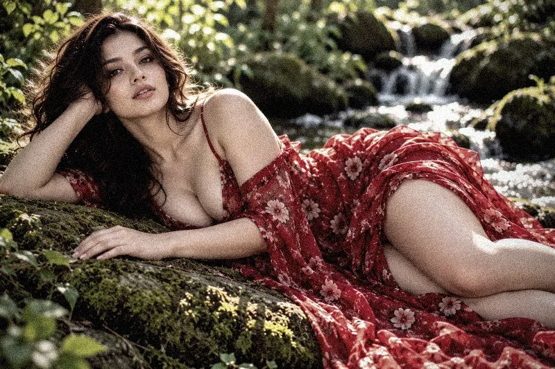
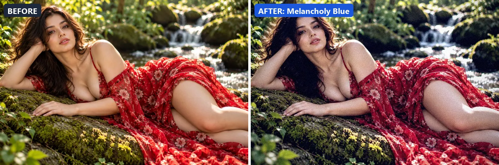
13. Melancholy Blue
Deep melancholy — steel blue tones, introspective and still.
This preset softens colour, adds a clearly cool, blue cast and adds some contrast. For depth it uses blue-tinted shadows. On top of that it applies extra clarity. The look is finished with a noticeable vignette and a touch of grain.
Brightness +2 · Contrast +18 · Saturation −18 · Gamma 0.97 · Warmth (R−B) −32 · Clarity +8 · Vignette 35 · Grain 8

14. Moody Fade
Cinematic mood — faded contrast, desaturated, heavy atmosphere.
Applied at 100%, it softens colour, lifts exposure slightly and gently lifts the midtones. It also adds blue-tinted shadows. It closes with a noticeable vignette and a touch of grain.
Brightness +5 · Contrast −5 · Saturation −18 · Gamma 1.08 · Warmth (R−B) −3 · Clarity +3 · Vignette 28 · Grain 12


15. Nostalgic Matte
Bittersweet nostalgia — faded matte, warm tones, memory-like softness.
The grade leans warm, lifts exposure slightly and opens up the midtones. Colour is split-toned with warm red-tinted shadows and warm golden highlights. In addition it flattens contrast for a soft, faded feel. Final touches: a light vignette and visible film grain.
Brightness +8 · Contrast −12 · Saturation −8 · Gamma 1.14 · Warmth (R−B) +12 · Vignette 22 · Grain 16


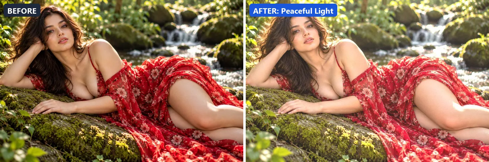
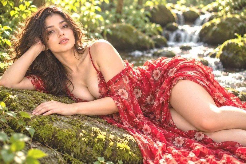
16. Peaceful Light
Serene peace — bright, airy, warm whites with gentle open shadows.
At full strength it brightens the frame and opens up the midtones. The look is split-toned with warm red-tinted shadows and warm golden highlights.
Brightness +18 · Contrast −8 · Saturation +5 · Gamma 1.22 · Warmth (R−B) +3 · Clarity +3 · Grain 2
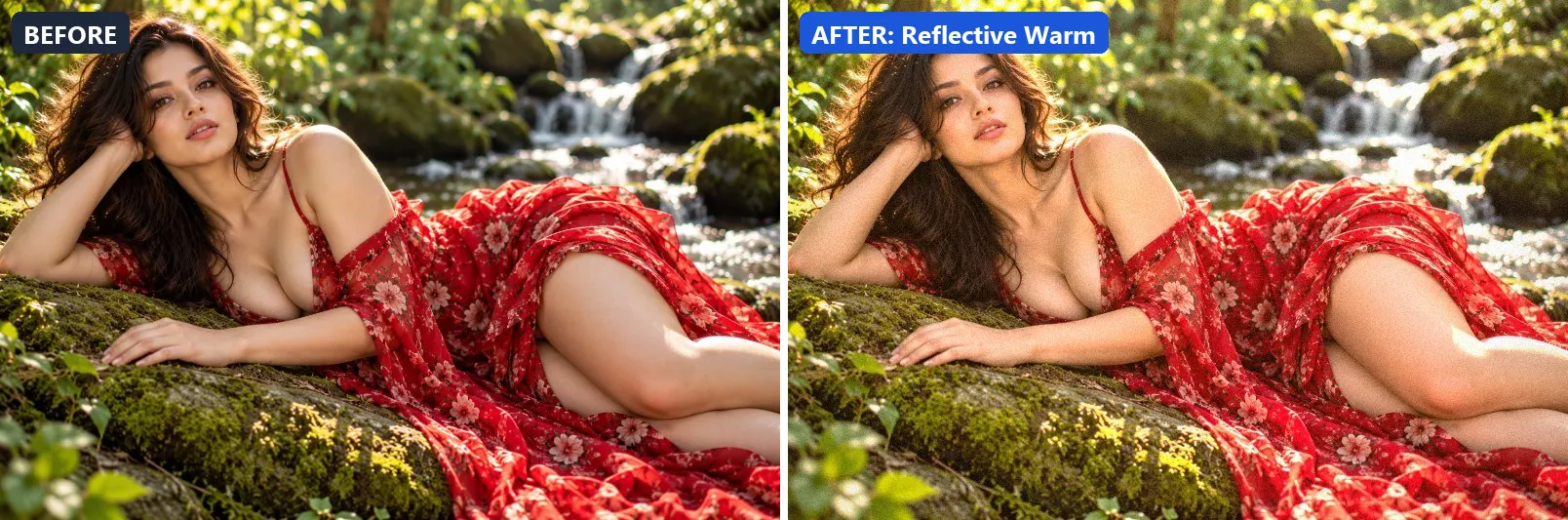
17. Reflective Warm
Quiet reflection — warm gentle tones, thoughtful and inward.
This preset leans warm, lifts exposure slightly and gently lifts the midtones. For depth it uses warm red-tinted shadows and warm golden highlights. The look is finished with a light vignette and a touch of grain.
Brightness +8 · Contrast +5 · Saturation +8 · Gamma 1.1 · Warmth (R−B) +12 · Clarity +5 · Vignette 18 · Grain 6

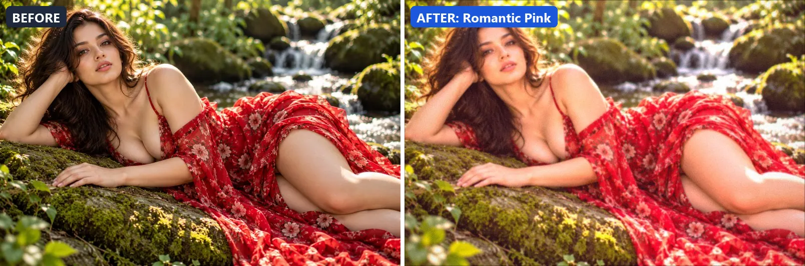
18. Romantic Pink
Love and romance — soft pink warmth, dreamy contrast, heart-flutter mood.
Applied at 100%, it boosts colour, leans warm, brightens the frame and opens up the midtones. It also adds warm red-tinted shadows and warm golden highlights. Beyond that it applies a soft blur of about 1 px for a dreamy look. It closes with a light vignette.
Brightness +12 · Contrast +5 · Saturation +18 · Gamma 1.14 · Warmth (R−B) +12 · Clarity +3 · Vignette 14 · Grain 4 · Blur 1
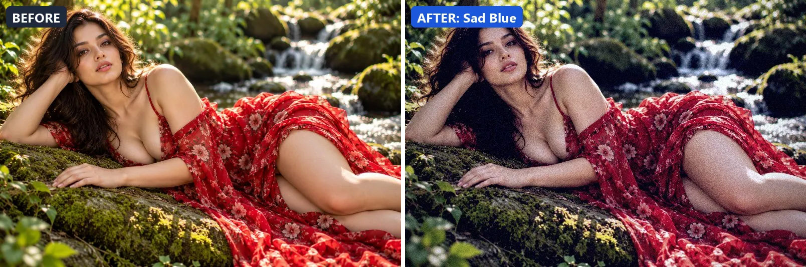
19. Sad Blue
Melancholic sadness — cold desaturated blue wash, low energy.
The grade softens colour, adds a clearly cool, blue cast, pulls exposure down a little and settles the midtones a bit darker. Colour is split-toned with blue-tinted shadows and cool, icy highlights. In addition it adds some contrast. Final touches: a noticeable vignette and a touch of grain.
Brightness −5 · Contrast +14 · Saturation −22 · Gamma 0.95 · Warmth (R−B) −36 · Clarity +5 · Vignette 38 · Grain 8

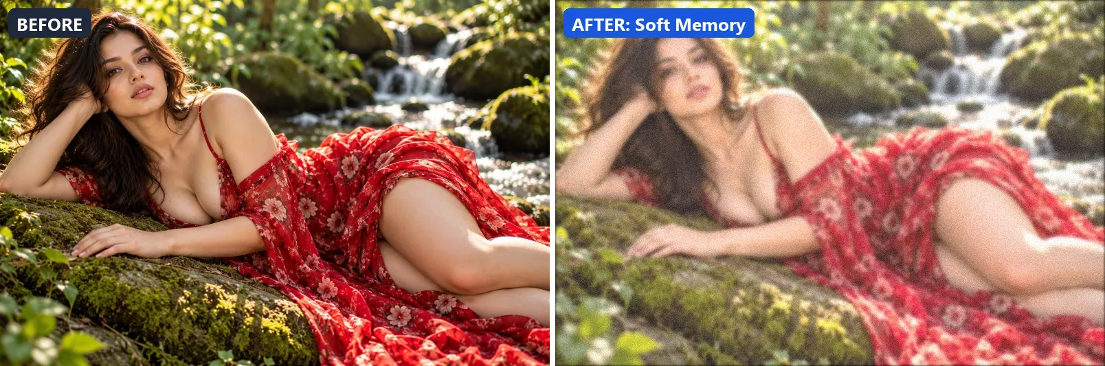
20. Soft Memory
Hazy memory — overexposed and soft, colours slightly wrong, distant.
At full strength it brightens the frame and opens up the midtones. The look is split-toned with warm red-tinted shadows and warm golden highlights. It also flattens contrast for a soft, faded feel and applies a soft blur of about 2 px for a dreamy look. To finish, it adds a touch of grain.
Brightness +18 · Contrast −20 · Saturation −5 · Gamma 1.28 · Warmth (R−B) +4 · Clarity −10 · Vignette 8 · Grain 8 · Blur 2

More filter groups
- Cinematic
- Portrait & Skin
- Landscape Pro
- Black & White
- Clarity & Detail
- Golden Hour
- Night & Astro
- Lighting Effects
- Atmosphere
- Artistic Styles
- Experimental FX
- Film Emulation
- Vintage Extras
- Natural Extras
- Travel Destinations
- Weather
- Seasons
- Corporate
- Fashion & Editorial
- Food & Product
- Sports & Action
- Social Media
- Architecture & Urban
Try these filters on your own photo
Free, runs in your browser, full-resolution download.