
Tailwind CSS uses a mobile-first approach for responsive design, allowing you to apply styles conditionally based on screen size. You can use classes like ‘sm:’, ‘md:’, ‘lg:’, and ‘xl:’ to define styles for different breakpoints.
In depth
In Tailwind CSS, responsive design is implemented by prefixing utility classes with breakpoint indicators. For example, 'sm:bg-red-500' will apply a red background on small screens and up, whereas 'bg-blue-500' would apply it by default for extra small screens. This mobile-first philosophy ensures your base styles are applied to all screens first, and then additional styles can be layered on for larger screens. This approach not only keeps your CSS concise but also makes it easier to manage responsive layouts without writing media queries manually.
It's also essential to understand how Tailwind's default breakpoints work, which are based on common device sizes, but you can customize these in your Tailwind configuration. Edge cases might involve ensuring elements maintain their intended flow and context across various screen sizes, especially in grid or flexbox layouts where spacing and alignment may need adjustment as the viewport changes.
Example scenario
In a recent project, we built a landing page that needed to look good on mobile and desktop devices. We utilized Tailwind's responsive classes, like 'md:flex' to switch from a column layout on small screens to a row layout on medium and larger screens. This allowed us to maintain a clean design without writing custom media queries, making our development process quicker and more efficient.
Common mistakes
One common mistake is to forget that Tailwind applies styles in a mobile-first fashion, leading developers to apply styles for larger screens first without considering how they might look on smaller devices. This can result in layouts that break or look cluttered. Another mistake is relying solely on responsive classes without testing the design at various breakpoints, which can cause unexpected layouts or usability issues on certain devices.
Follow-up questions
- Can you name the default breakpoints used in Tailwind CSS?
- How would you customize these breakpoints if needed?
- What strategies would you employ to test responsiveness on various devices?
- Can you explain the importance of the mobile-first approach in CSS?
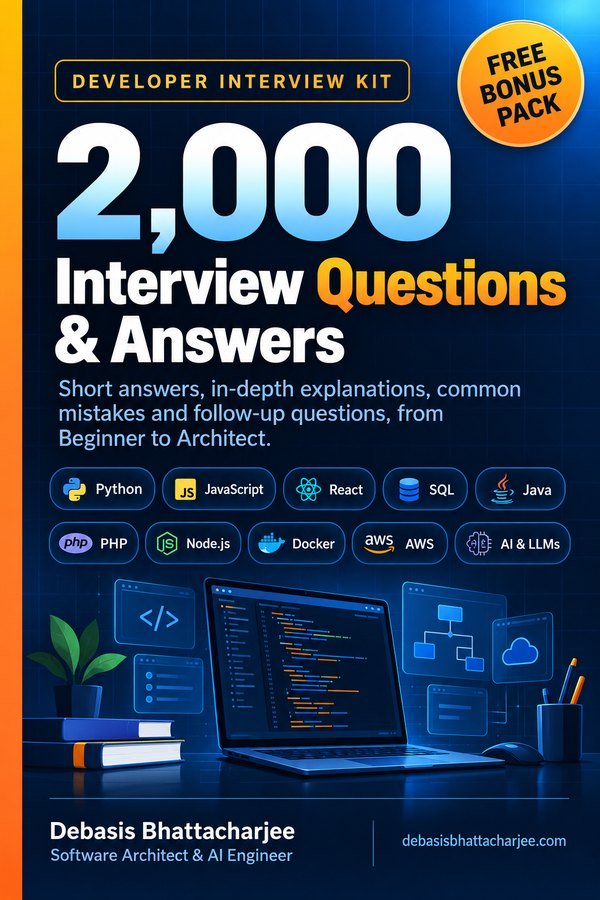
Want all 2,000 questions in one PDF?
- Short answers, in-depth explanations, common mistakes and follow-ups
- 89 topics, from Beginner to Architect, with a clickable contents list
- 226 extra questions that are not on this website
- Free Bonus Pack: 30-day study plan, behavioral questions, salary scripts
Includes 226 extra questions that are not on this site, plus a free Bonus Pack.
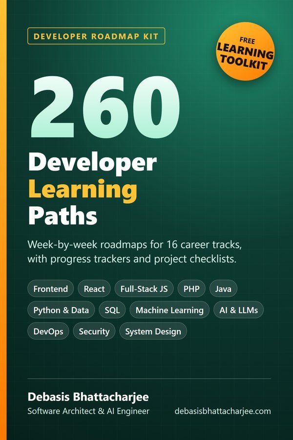
Get both books for $9.99 (save $2.99):
The material stays free to read online. This is the organised, offline, print-ready PDF edition. Secure payment by PayPal; your personal download link is emailed after payment is confirmed. Digital product, no shipping.