SCSS allows for the encapsulation of styles through features like variables and mixins, which can help maintain a consistent design and reduce the risk of styling overrides. By structuring styles…
Tag
#css
Can you explain how SCSS can help mitigate security risks related to user-defined styles in a web application?
🏷️
Can you explain how to leverage SCSS mixins and when they might be more advantageous than using standard CSS classes?
SCSS mixins allow you to create reusable blocks of styles that can include parameters, making them highly flexible. They are particularly advantageous when you need to apply a set of…
🏷️
Can you explain what utility-first CSS means in the context of Tailwind CSS and how it differs from traditional CSS approaches?
Utility-first CSS in Tailwind means using single-purpose utility classes to style elements directly in the markup. This contrasts with traditional CSS where styles are typically defined in a separate stylesheet…
🏷️
Can you explain how the CSS Flexbox layout model works and give an example of its use?
The CSS Flexbox layout model provides a way to arrange items in a one-dimensional space along a row or column. It allows for responsive design, distributing space dynamically and aligning…
🏷️
Can you describe a time when you had to optimize the performance of CSS in a large-scale application, and what techniques did you use to ensure both speed and maintainability?
In a previous project, I identified that our CSS files were causing significant rendering delays. To optimize, I implemented modular CSS with BEM methodology, minimized file sizes with preprocessing, and…
🏷️
How can using Sass/SCSS help mitigate security vulnerabilities related to CSS?
Sass/SCSS can help mitigate security vulnerabilities by enabling the use of variables, mixins, and nesting which promotes cleaner and more maintainable code. This reduces the risk of errors and vulnerabilities…
🏷️
How do you approach optimizing the performance of large SCSS files in a production environment, and what specific strategies would you employ?
I focus on modularizing styles, using mixins effectively, and minimizing nesting. Additionally, I leverage the @use and @forward directives for better module loading, and I implement selective loading to ensure…
🏷️
How can you mitigate CSS injection attacks in a large-scale web application architecture?
To mitigate CSS injection attacks, it’s essential to implement strict Content Security Policy (CSP) headers, sanitize any user-generated content that may be injected into styles, and avoid inline styles wherever…
🏷️
Can you explain what utility-first CSS is in Tailwind CSS and how it differs from traditional CSS approaches?
Utility-first CSS in Tailwind CSS emphasizes using single-purpose utility classes to style elements directly in your HTML. This approach differs from traditional CSS, where styles are often defined in separate…
🏷️
Can you describe a situation where you had to troubleshoot a CSS issue in a project? What steps did you take to resolve it?
In a recent project, I encountered an issue where the layout of a page was broken in certain browsers. I used the developer tools to inspect the elements, identify conflicting…
🏷️
How does Tailwind CSS help improve security in web development, especially in terms of preventing CSS injection attacks?
Tailwind CSS mitigates the risk of CSS injection attacks by promoting the use of utility classes, which reduces the reliance on custom styles. This limits the scope for attackers to…
🏷️
How does Tailwind CSS handle responsive design, and can you give an example of how you would implement a responsive layout using Tailwind?
Tailwind CSS uses a mobile-first approach for responsive design through breakpoint prefixes on utility classes. For example, to create a responsive grid, I could use classes like ‘grid-cols-1’ for mobile…
🏷️
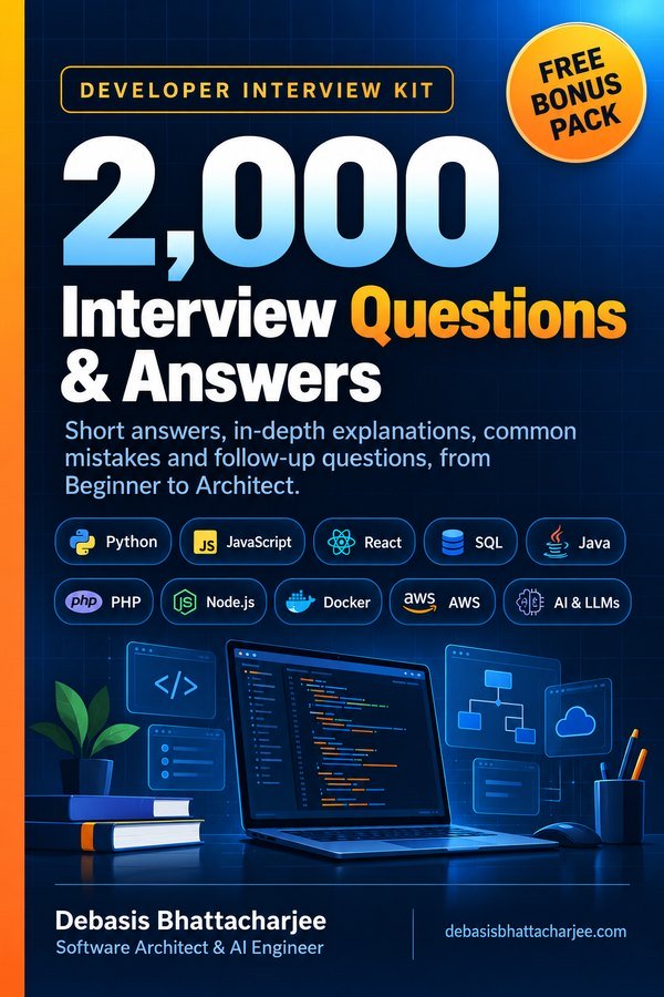
Developer Interview Kit · PDF

2,000 Interview Questions & Answers, in one PDF
- Short answers, in-depth explanations, common mistakes and follow-ups
- 89 topics, from Beginner to Architect, with a clickable contents list
- 226 extra questions that are not on this website
- Free Bonus Pack: 30-day study plan, behavioral questions, salary scripts
$7.99 one-time · instant email delivery
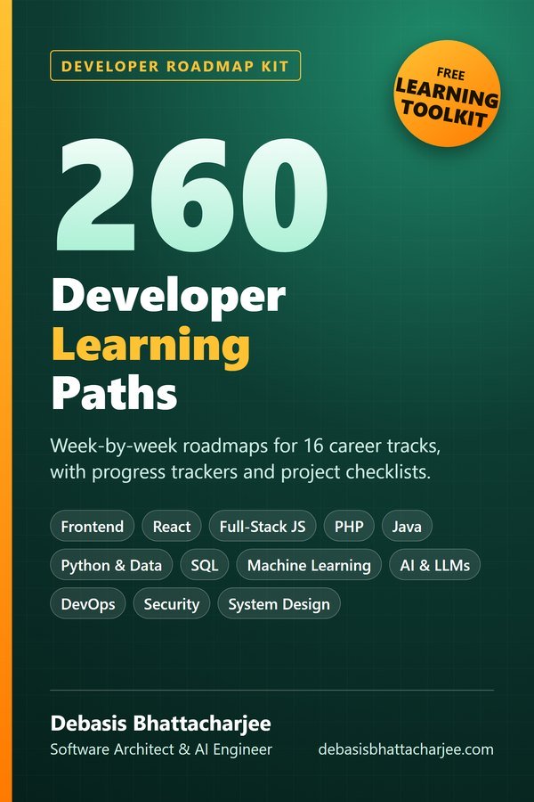
Also available: 260 Developer Learning Paths $4.99
Week-by-week roadmaps for 16 career tracks (Python, React, Java, DevOps, SQL, AI and more), with a progress tracker on every path.
See what's inside →
Get both books for $9.99 (save $2.99):
The material stays free to read online. This is the organised, offline, print-ready PDF edition. Secure payment by PayPal; your personal download link is emailed after payment is confirmed. Digital product, no shipping.