Palette ++
Generate, explore and export beautiful color palettes for designers and developers
Palette++ is a full-featured color palette studio for Windows. Generate palettes from any starting color using multiple algorithms — complementary, analogous, triadic, split-complementary, tetradic and monochromatic. Paste any image and Palette++ extracts a dominant color palette automatically. The explorer mode lets you browse thousands of curated palettes from the built-in library. Every color shows its hex, RGB, HSL, HSV and CMYK values — copy any format with one click. Export palettes as PNG swatches, SVG, CSS variables, JSON, Adobe ASE, Tailwind config or SCSS. Palette++ also includes a screen color picker, a contrast checker for accessibility compliance and a palette history so you never lose a combination you liked.
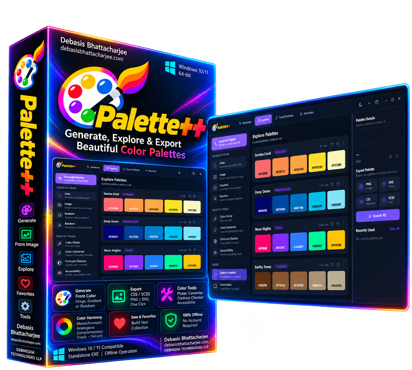
See Palette++ in Action
A clean, modern interface designed for real-world use.
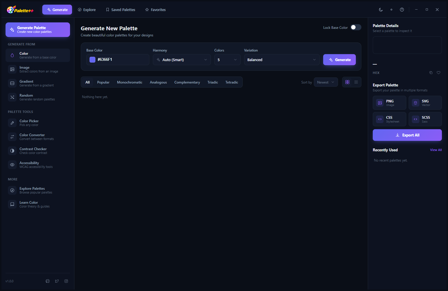
Paletteplusplus screen 01 screenshot
What Is Palette++?
Palette++ is a Windows desktop color design tool that combines four creative and analytical capabilities into one application: a harmony-based palette generator, an explorable library of curated palettes, a precision color picker with multi-format output, and a WCAG accessibility contrast checker. Designers, developers and anyone working with color can generate entire palettes from a single base color using classical harmony rules, explore collections of named palettes, copy any color value in HEX, RGB, HSL or CMYK, and verify whether their text-on-background combinations meet accessibility standards. Palette++ runs offline with all data stored locally — no account required, no uploads, no subscription.
Screen-by-Screen Feature Walkthrough
Generate New Palette — Harmony-Based Creation
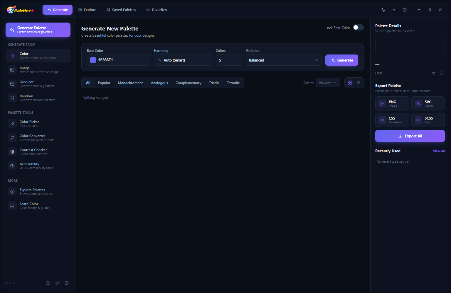
The Generate New Palette screen is the starting point for creating original color palettes. Choose a base color using the color picker or by entering a HEX value, then select a harmony rule — Analogous, Complementary, Split Complementary, Triadic, Tetradic, Monochromatic or Shades — and Palette++ generates a complete palette following that harmonic relationship. Filter tabs along the top let you browse generated palettes by mood: All, Warm, Cool, Neutral, Vibrant, Earthy and others. Export buttons in the top-right allow saving the complete palette as PNG, SVG, JSON or CSS variables for immediate use in design and development projects.
Explore Palettes — Curated Collection Library
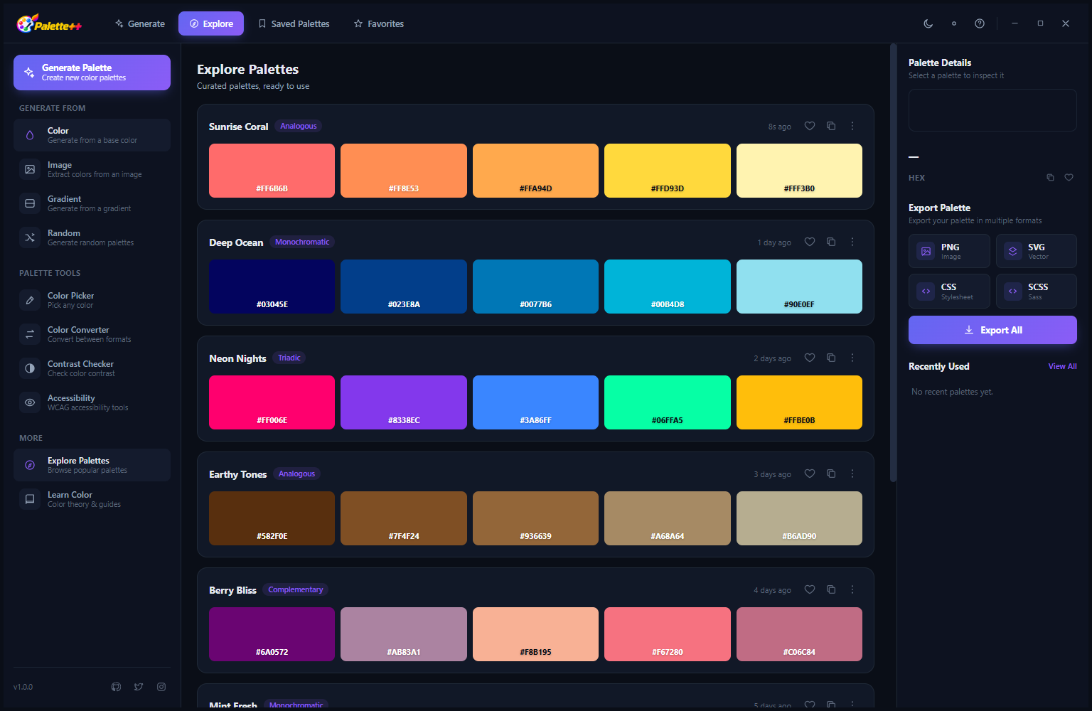
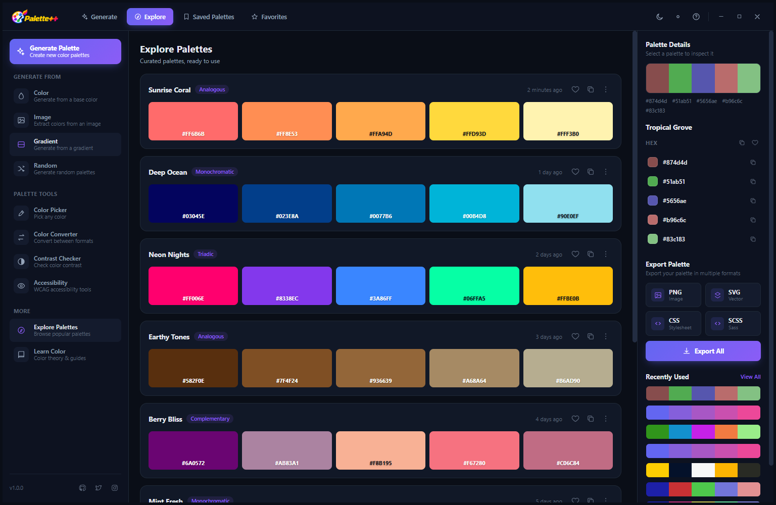
The Explore Palettes view displays a library of curated, named palettes as cards. Each palette card shows the palette name (Sunrise Coral, Deep Ocean, Neon Nights, Earthy Tones, Berry Blue) and five color swatches with their HEX codes displayed below each swatch. Hover over any swatch to see the full color details and copy the value. Click a palette card to open it for detailed inspection, save it to your Favorites or use it as the starting point for generating variations. The curated library provides a fast starting point when you need a cohesive palette that conveys a specific mood without building from a single color from scratch.
Saved Palettes — Your Personal Collection
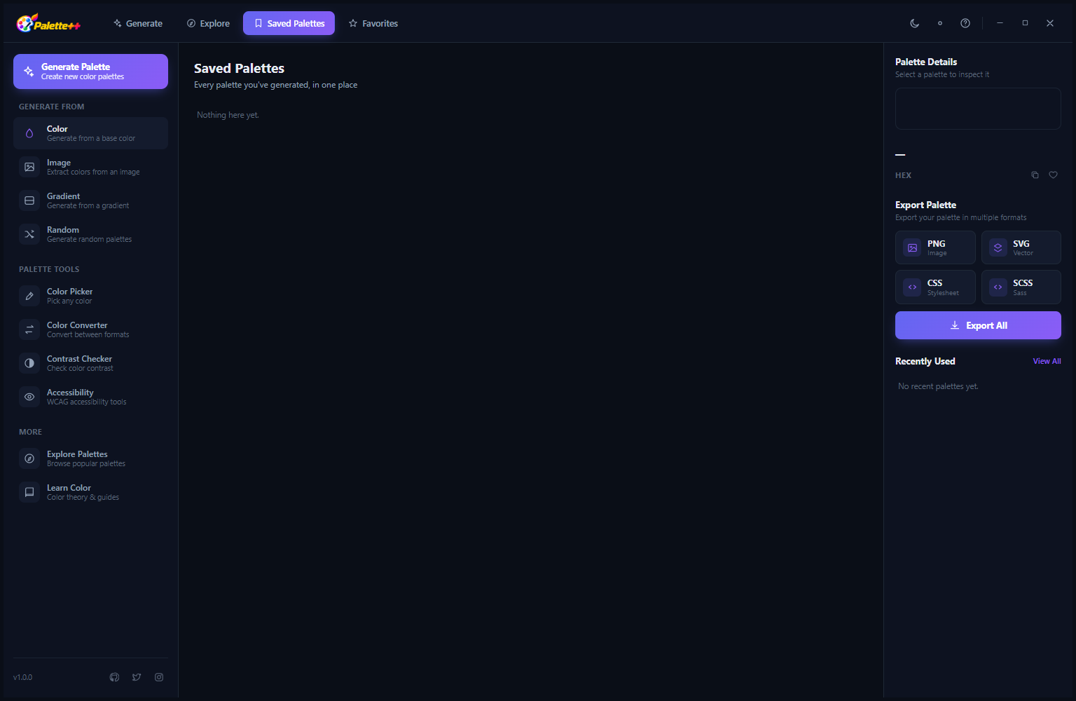
The Saved Palettes view collects all the palettes you have bookmarked from the Explore library or saved from your own generations. Like the Explore view, each palette is shown as a card with swatches and color codes. Your saved collection grows into a personal library of approved color palettes organized by when they were saved. You can rename saved palettes, remove palettes you no longer need, and search the saved collection by palette name or by a specific color value to find palettes containing that color.
HarmMap — Favorites and Color Relationships
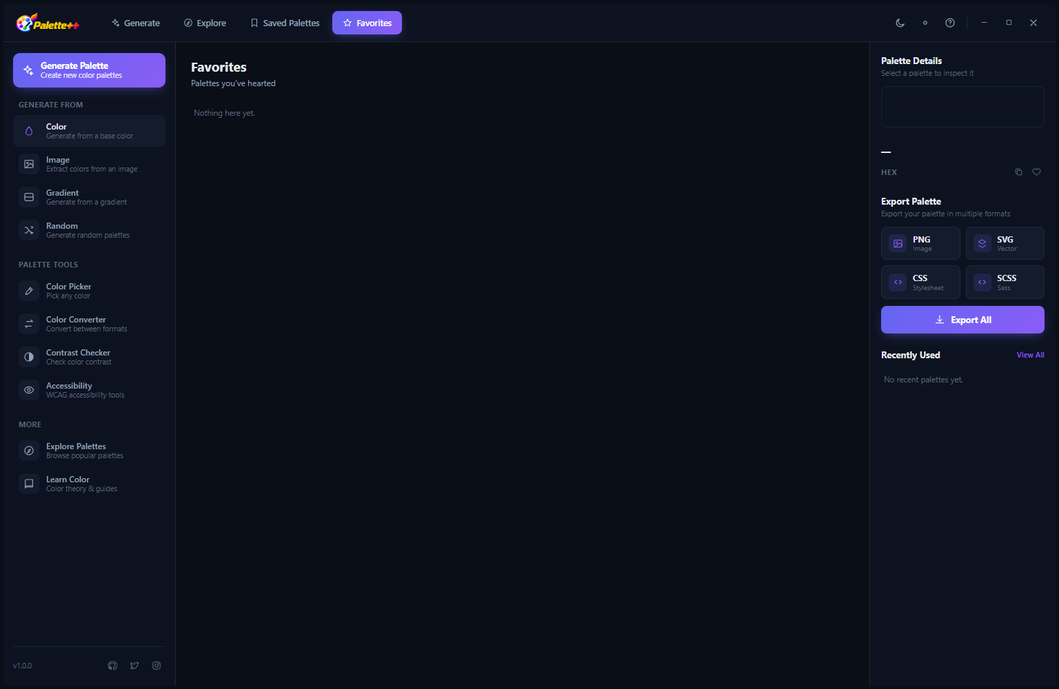
The HarmMap view (accessible from the navigation tabs) is a visual representation of color harmony relationships — showing how the colors in your favorite palettes relate to each other on a color wheel. The empty state in this screenshot shows that no favorites have been added yet, with a helpful instruction: star palettes from the Explore view to see their harmonic relationships visualised in the HarmMap. Once palettes are added, the HarmMap displays the color wheel positions of each palette’s colors, making the harmony patterns — complementary pairs, triadic triangles, analogous clusters — immediately visible as geometric relationships.
HarmMap — Color Wheel Visualization
With favorited palettes loaded, the HarmMap displays a color wheel with each palette’s colors plotted as dots at their hue positions. Complementary colors appear on opposite sides of the wheel; analogous colors cluster together in a narrow arc; triadic colors form a triangle; tetradic colors form a square or rectangle. This visual representation makes it easy to understand why a palette works — or does not work — by seeing the geometric relationship between its colors. The HarmMap is a learning tool as much as an analysis tool, building an intuitive understanding of color harmony theory through visual experience.
Generated Palettes — Slash Rose and Emerald Stone
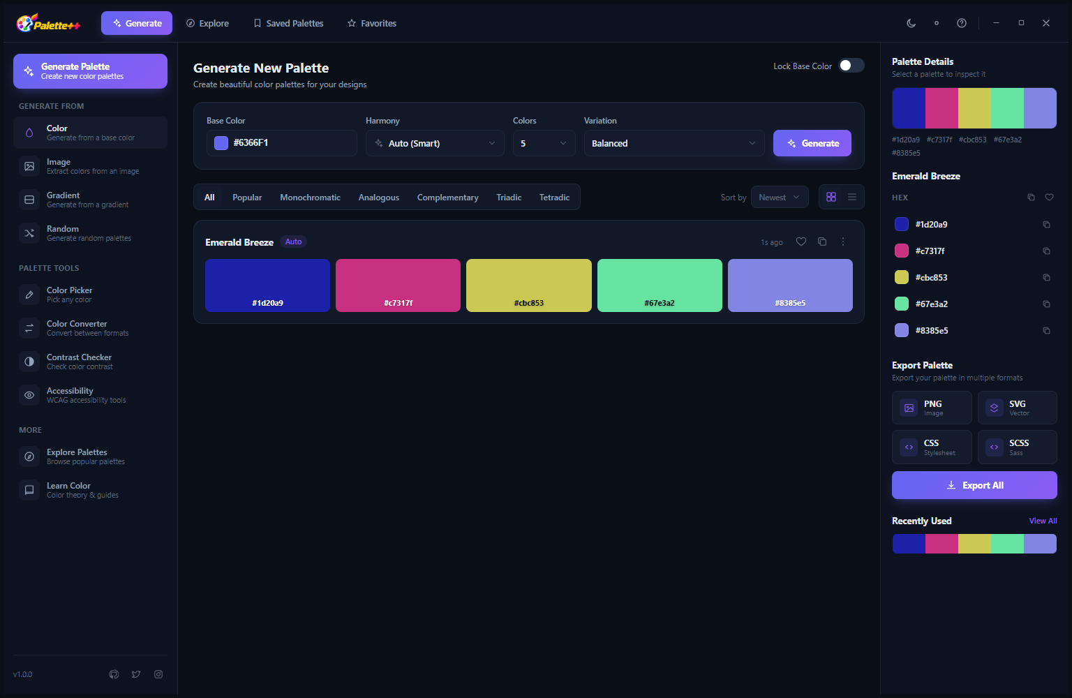
This generation result shows two named palettes: Slash Rose (a warm rose harmony with five swatches ranging from deep burgundy through mid rose to soft blush pink) and Emerald Stone (a jewel-green harmony from deep forest through rich emerald to bright spring green). Each swatch in both palettes shows its HEX code below the color. The generated palette names are automatically assigned based on the dominant hue and the harmony style, giving you a memorable reference name for each palette without needing to name it yourself. Click any swatch to copy its HEX code directly to the clipboard.
More Generated Palettes — Dark Mode Results
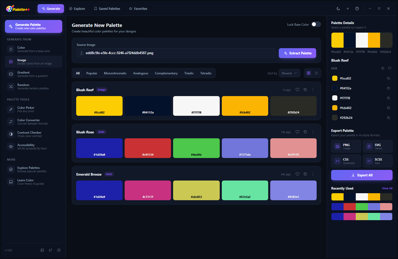
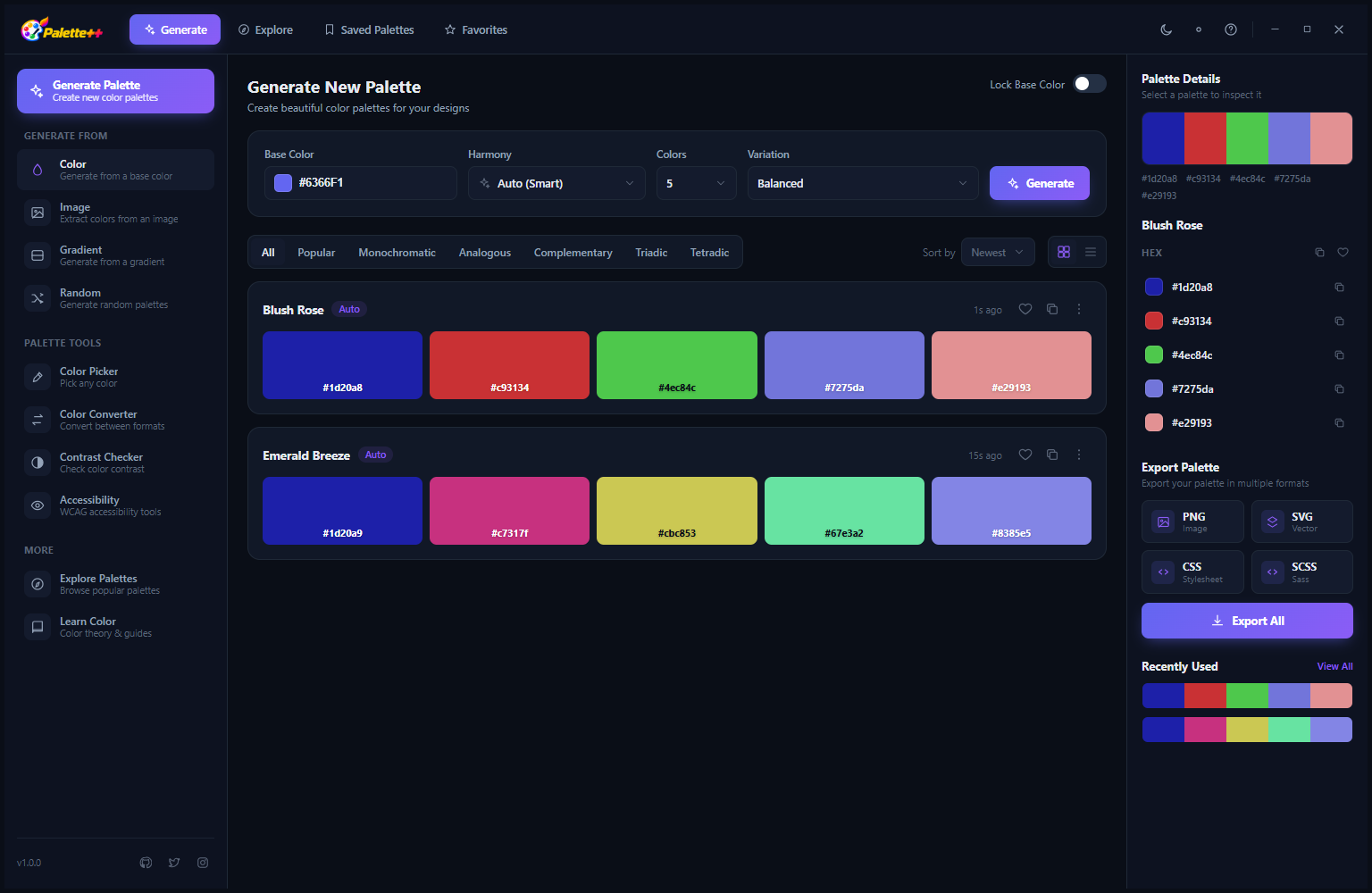
Multiple generation results are shown together, allowing you to compare different harmony variations generated from the same or nearby base colors. Each generation run produces multiple palette suggestions based on the selected harmony rule, giving you choices rather than a single output. When a palette generation produces a result that is close to but not exactly what you want, generating again with a slightly adjusted base color or a different harmony rule quickly converges on the target palette. All generated palettes can be saved with a single click on the bookmark icon.
Generate — Royal Bloom, Slash Surf, Neon Acre, Emerald Stream
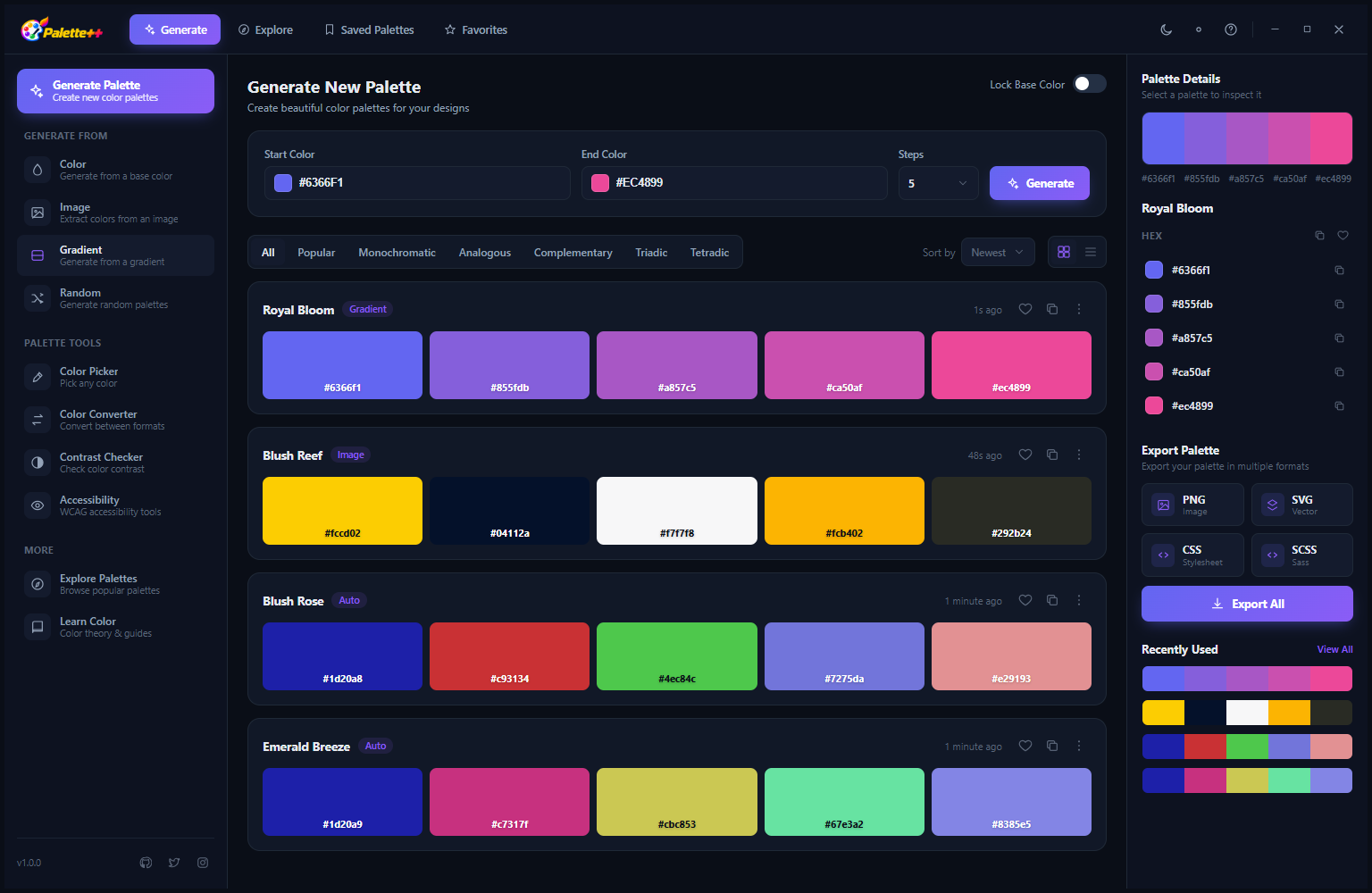
A single generation run produces multiple named palette options simultaneously. This set shows four palettes with distinct personalities: Royal Bloom (deep purples and soft lavenders with regal character), Slash Surf (clear ocean blues from deep navy to bright sky), Neon Acre (electric cyans and greens with high-energy contrast) and Emerald Stream (rich emerald through teal, organic and sophisticated). Having four options displayed together makes choosing the right palette for a specific mood or project straightforward — you see the full range of what is possible from the current base color and harmony rule in one view.
Generate — Saved and Variant Views
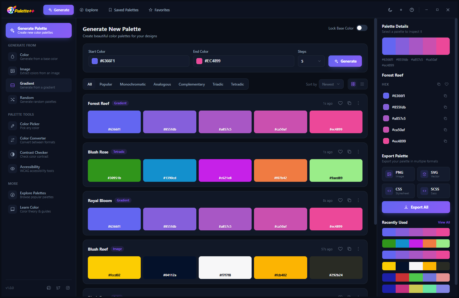
The generation panel maintains access to both the current generation results and the full configuration controls — base color selector, harmony rule dropdown and filter tabs — visible simultaneously. This side-by-side layout means you can generate, review, adjust the base color slightly and generate again without navigating between different screens. The bookmark icon on each palette card saves it to your collection instantly. The workflow is iterative by design: generate, compare, refine the base color, generate again, and save the best results to build up a library of approved palettes for a project.
Color Picker — Multi-Format Color Values
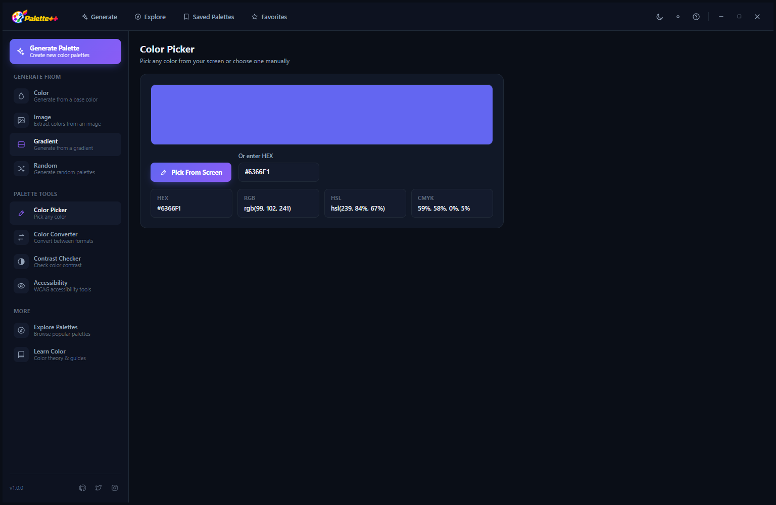
The Color Picker provides precise color values in four formats simultaneously for any selected color. The current selection — #D082F7, a vivid violet-purple — is shown as a large color preview, and below it the values are displayed in HEX (#D082F7), RGB (208, 130, 247), HCL (hue, chroma, lightness) and CMYK (for print color specification). Each format has a copy-to-clipboard button so you can grab the exact value you need without manual conversion. The “Pick Page Device” button activates the screen color picker, which lets you click anywhere on your Windows screen to capture that color — from a website, an image, a design file or any other visible pixel.
Color Picker — Screen Capture Mode
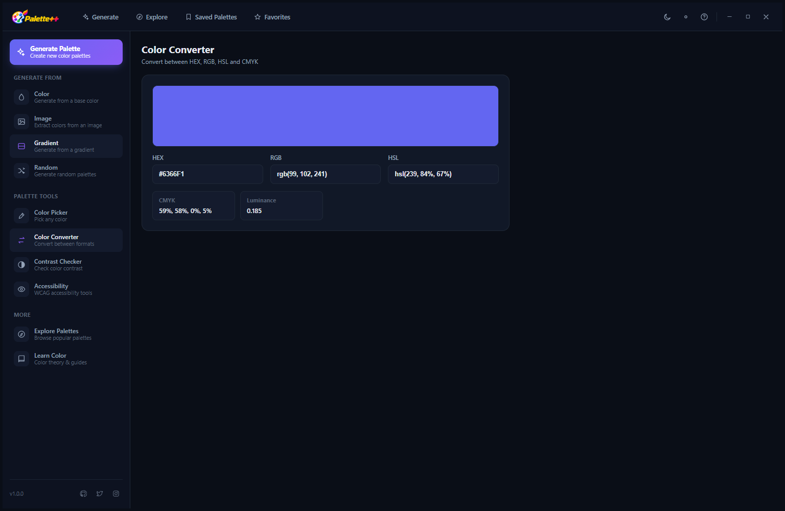
When the screen color picker is active, the cursor becomes a precision color sampler. Move it over any part of your Windows display — a color swatch in a design file, a specific pixel in a photograph, a button background color on a website — and the color value updates in real time as the cursor moves. Click to capture the color and lock its values in all four formats. This makes Palette++ the tool you reach for whenever you need to identify an exact color from anything visible on your screen, whether you are matching a brand color from a PDF, extracting a color from a client’s website or sampling from a reference image.
Contrast Checker — WCAG Accessibility Validation
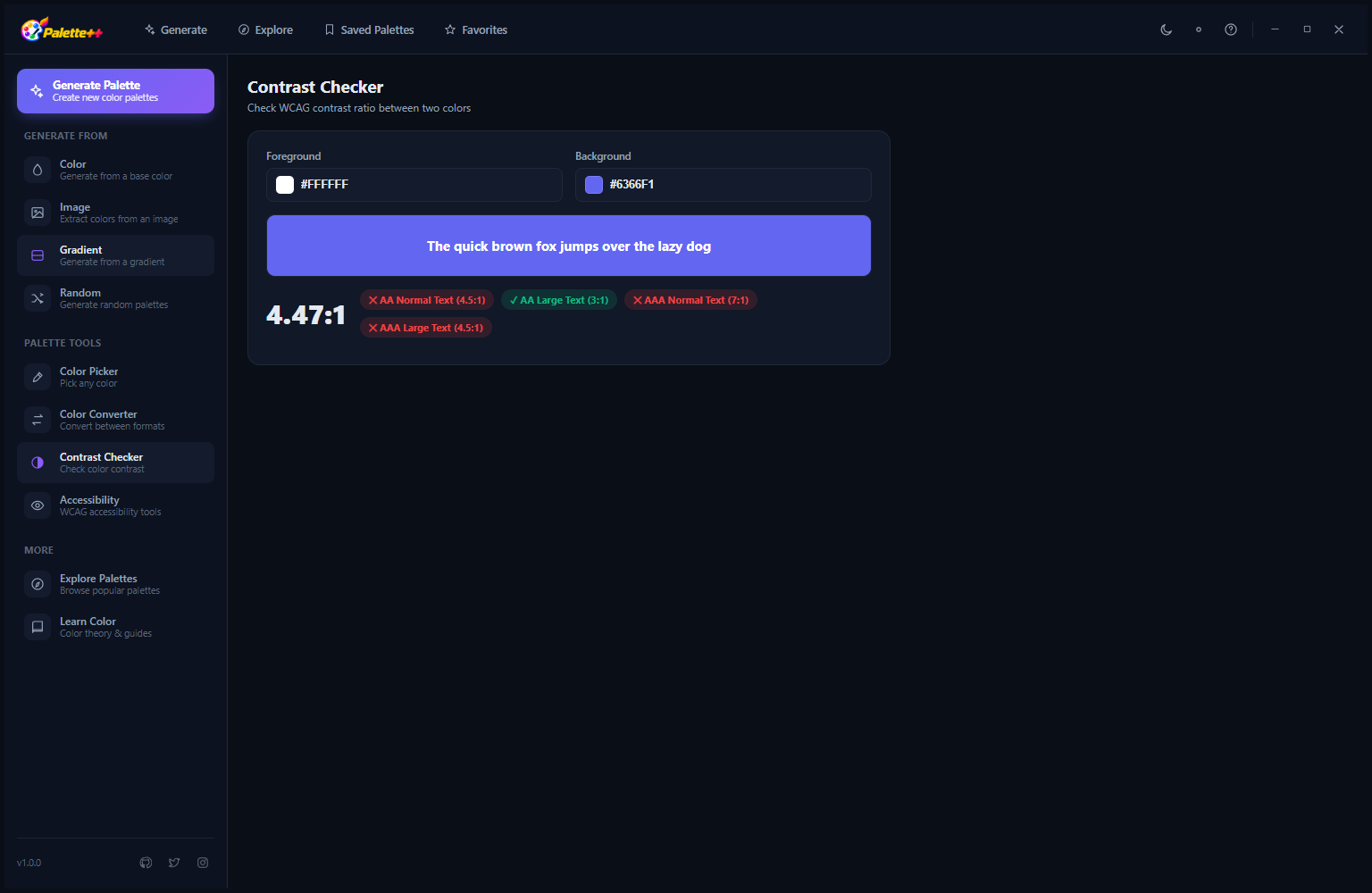
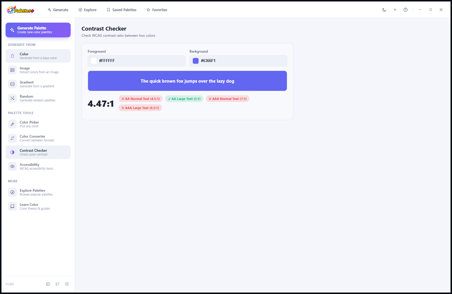
The Contrast Checker is an essential tool for any designer or developer working on accessible interfaces. Enter a foreground color (text) and a background color, and Palette++ instantly calculates the contrast ratio (4.47:1 in this example) and shows the WCAG 2.1 compliance result for both AA and AAA standards at both normal text size and large text size. The current result shows AA Pass for both text sizes and AAA Pass for large text, but AAA Fail for normal-sized text — clear guidance that this combination is accessible for body text under AA (the standard for most web content) but does not meet the stricter AAA threshold. A text preview below the results shows the combination rendered visually so the legibility judgment is not purely numerical.
Tool Views — Dark Mode Tools
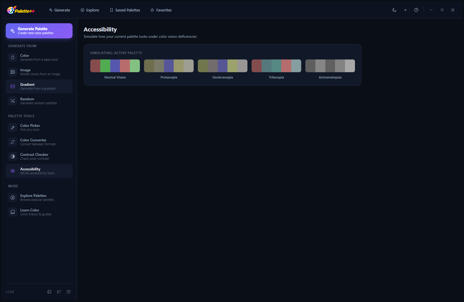
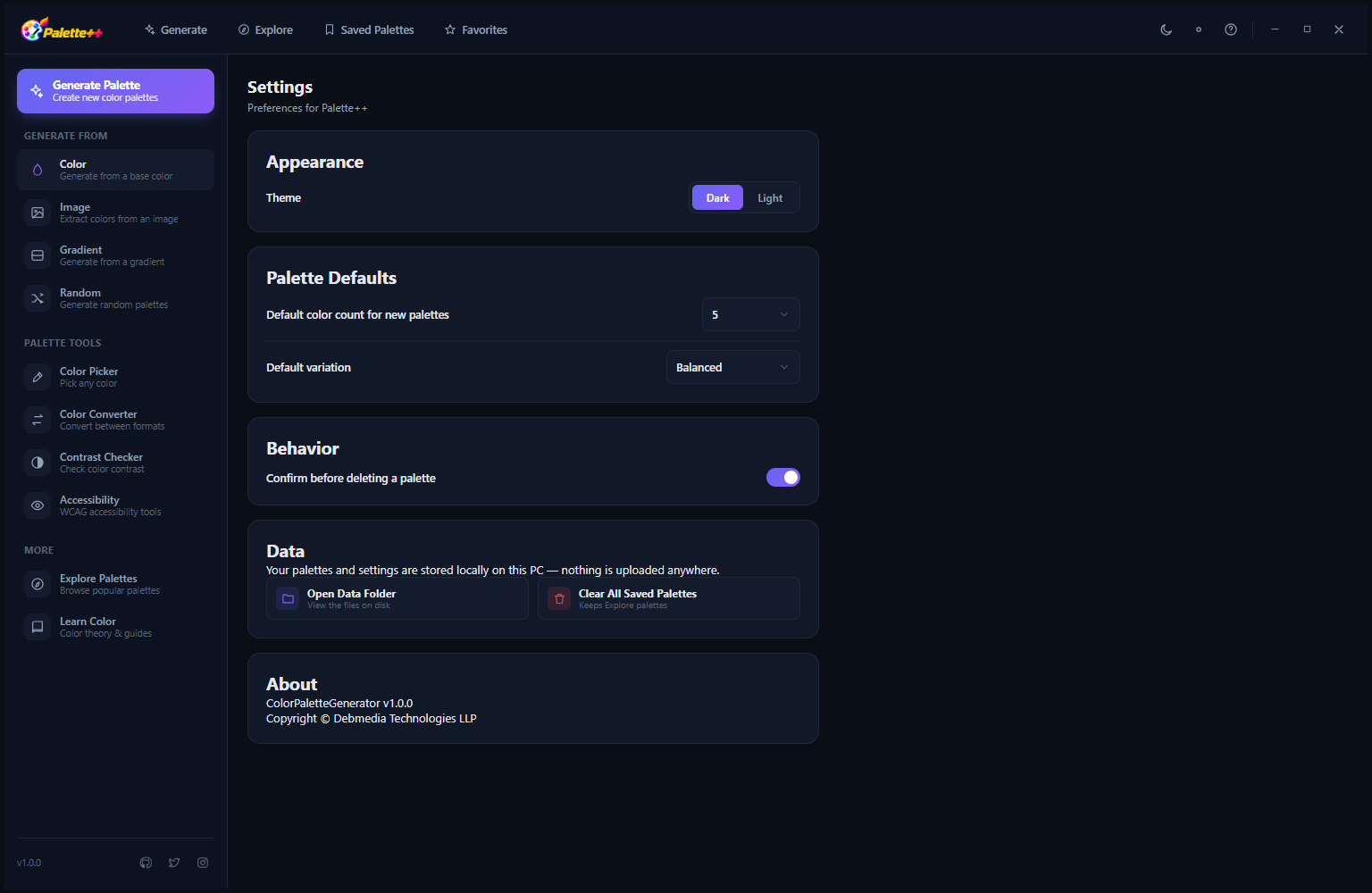
All Palette++ tools share the same consistent dark mode interface — deep near-black backgrounds, purple accent colors and high-contrast white text throughout. The visual consistency across the palette generator, color picker, contrast checker and explore library makes switching between tools feel seamless. The sidebar navigation labels remain visible in all views, and the currently active section is highlighted with the purple accent color so your navigation position is always clear in the interface.
Settings and Configuration
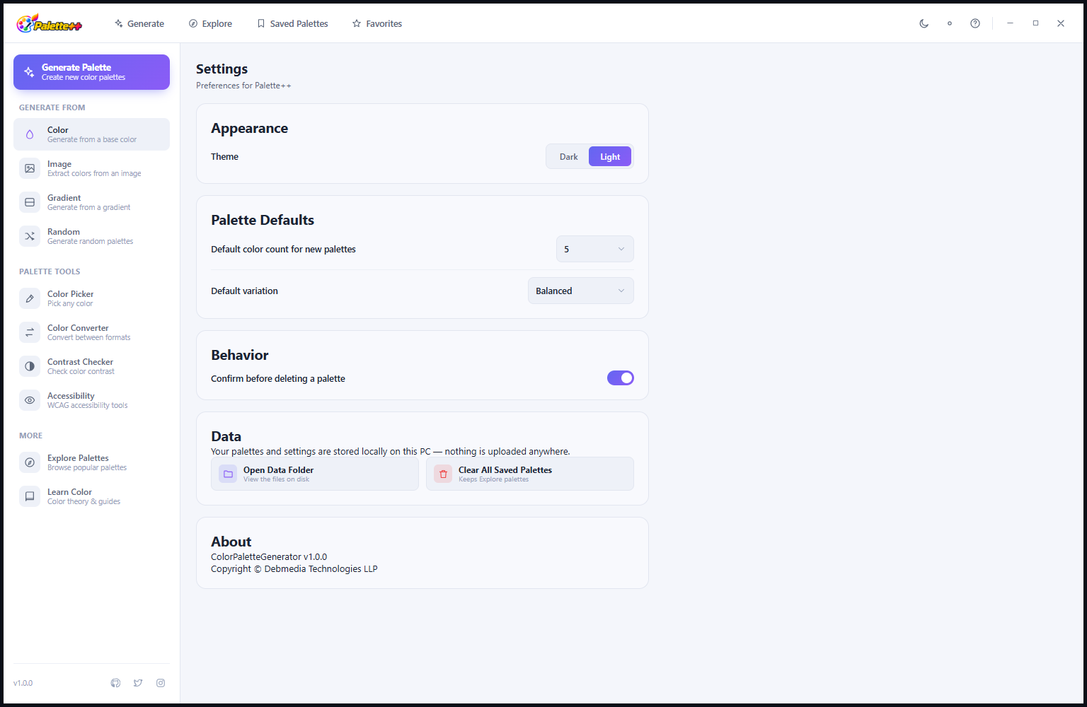
The Settings screen provides straightforward configuration: toggle between Dark Mode (the default) and Light Mode from the Theme selector, set the default export format for palette exports (PNG, SVG, JSON or CSS), choose the default color space for color picker output (HEX, RGB or HSL), configure whether the screen color picker captures at single-pixel precision or with anti-aliasing averaging, and set the language. The theme toggle is the most frequently used setting — switching between dark and light mode changes the visual appearance of the entire application immediately without requiring a restart.
Learn Color Theory — Reference Guide
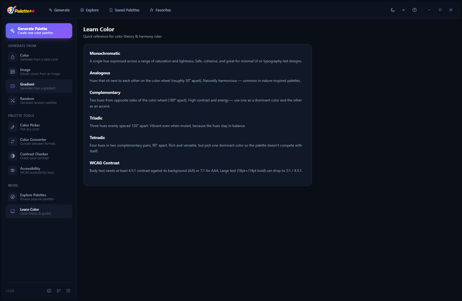
The Learn Color section is a built-in color theory reference that explains the harmony rules Palette++ uses. Six illustrated cards cover: Monochromatic (variations of a single hue), Analogous (colors adjacent on the color wheel), Complementary (colors directly opposite on the wheel), Triadic (three colors equidistant on the wheel), Tetradic (four colors forming a rectangle on the wheel) and WCAG Contrast (the mathematics behind accessibility contrast ratios). Each card includes a color wheel diagram showing the geometric relationship and a brief explanation of when each harmony type is most effective. This reference is valuable for designers who want to understand the principles behind the palettes they are generating, not just use them.
Palette++ also offers a full Light Mode in addition to its signature dark interface. Every tool you have seen above — palette generation, exploration, Color Picker, Contrast Checker and color theory reference — is equally available in Light Mode. Switch instantly from the theme toggle in Settings. Here is the complete application in Light Mode:
Explore Palettes — Light Mode
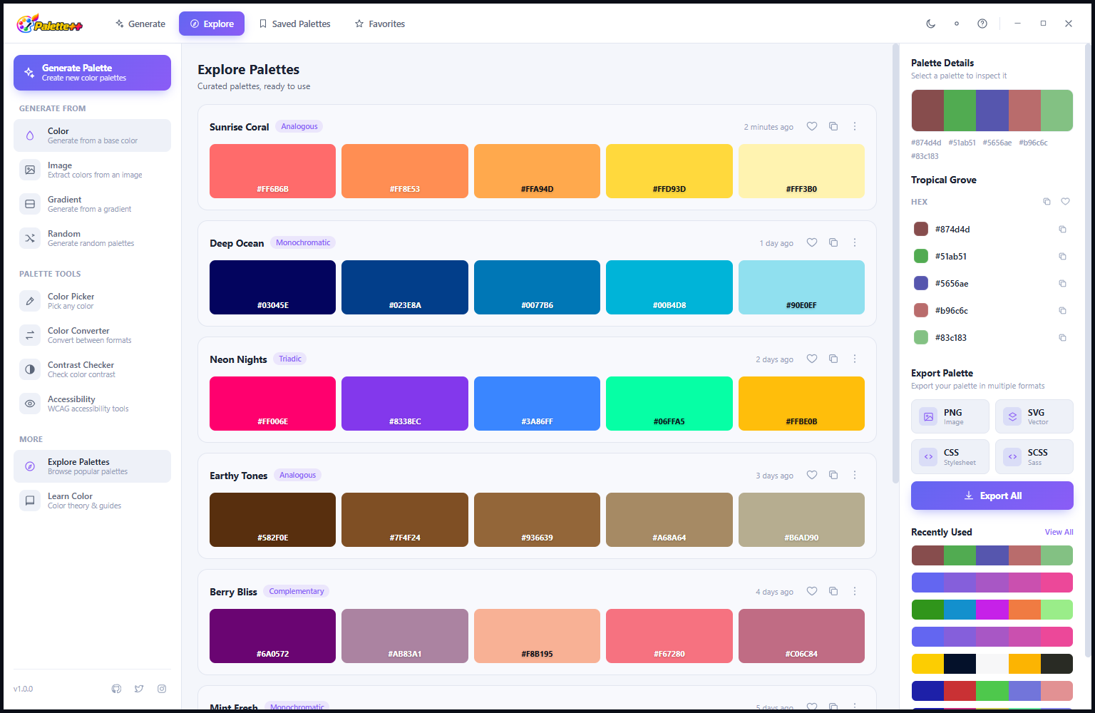
In Light Mode, the Explore Palettes view presents the same curated palette library on a clean white background with dark text. The palette cards are equally readable in both modes — in Light Mode, the color swatches stand out with high contrast against the white background, making subtle color differences between swatches especially easy to see. The Tropical Grace palette is shown selected, with its warm turquoise and coral tones immediately visible. The sidebar navigation and toolbar retain their layout and functionality; only the background and text colors change between modes.
Learn Color Theory — Light Mode
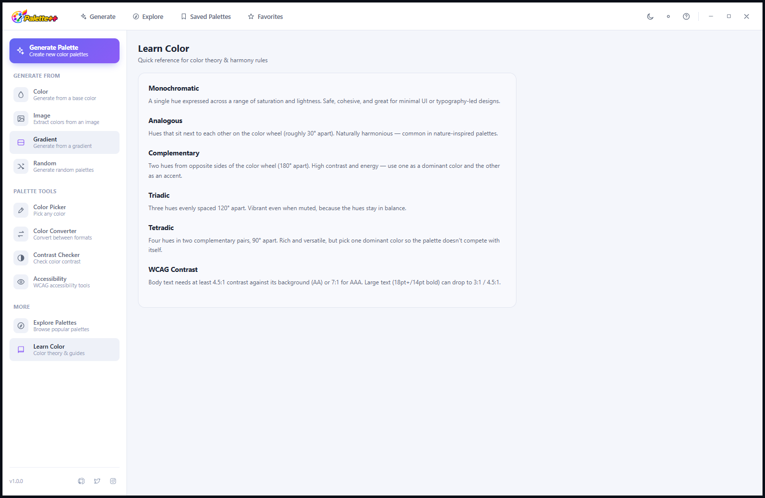
The Learn Color Theory section in Light Mode uses the white background to give the color wheel diagrams on each card more visual breathing room. The diagrams themselves — which show the geometric harmony relationships in vivid color — benefit from the lighter background, which makes the harmony pattern angles and arcs easier to read. The six theory cards (Monochromatic, Analogous, Complementary, Triadic, Tetradic, WCAG Contrast) are identical in content to the dark mode version; the lighter surrounding context changes the reading experience for users who prefer working in a bright environment.
Tool Views — Light Mode
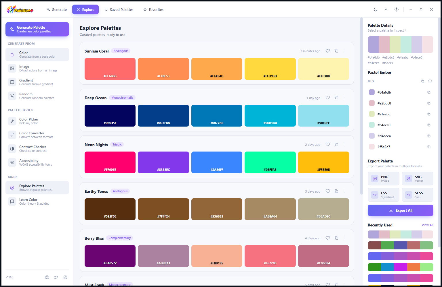
All sections of Palette++ — palette generator, explorer, HarmMap, color picker and contrast checker — display in the clean light-themed interface when Light Mode is active. The purple accent color used for highlights and selected states remains consistent between modes, maintaining the Palette++ visual identity regardless of which theme is active. The choice between dark and light mode is purely a matter of personal preference and working environment — both modes provide the same full feature set with no differences in tool availability or functionality.
Color Picker — Light Mode
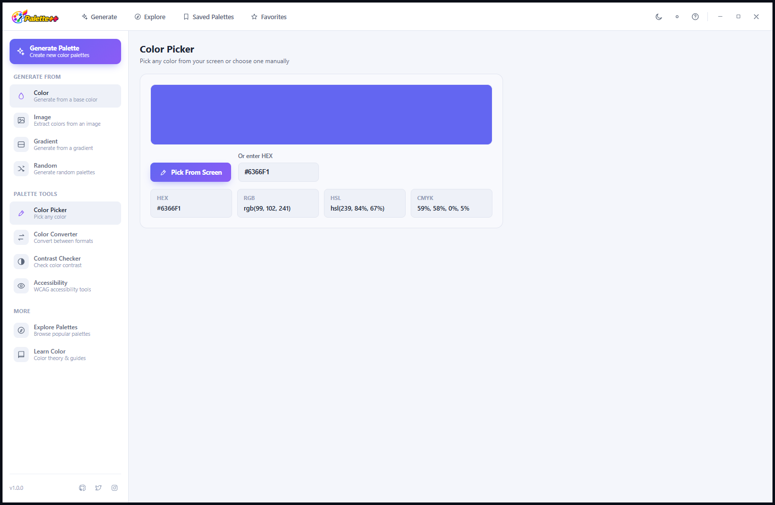
The Color Picker in Light Mode provides the same precision color value display — HEX, RGB, HCL and CMYK — on a white background. The large color preview swatch and the format-specific value panels are just as readable in Light Mode as in dark mode. The screen color picker function (Pick Page Device) works identically in both modes — activating it always captures from the actual screen pixels regardless of which theme Palette++ is currently using. For designers who work primarily in bright-background design tools, having Palette++ in Light Mode creates a more visually consistent working environment.
Generate Palettes — Light Mode
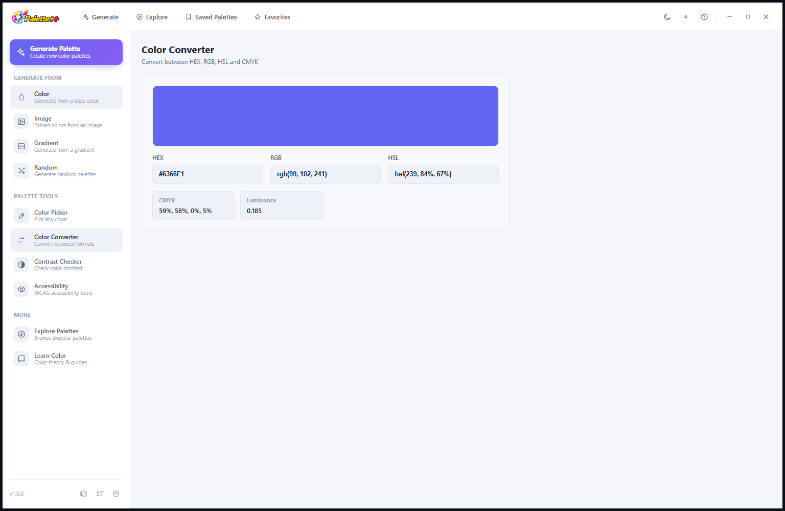
Generated palette cards in Light Mode display against a white card background with light grey borders — a clean, minimal presentation that lets the palette colors themselves carry the visual weight. Each swatch in a generated palette is shown with its hex code in a dark readable text below, and the palette name appears prominently above the swatches. The generation controls (base color, harmony rule, filter tabs) use the same layout as in dark mode; the white background variation makes the color input controls particularly clear and easy to use.
Saved and Explore — Light Mode Browsing
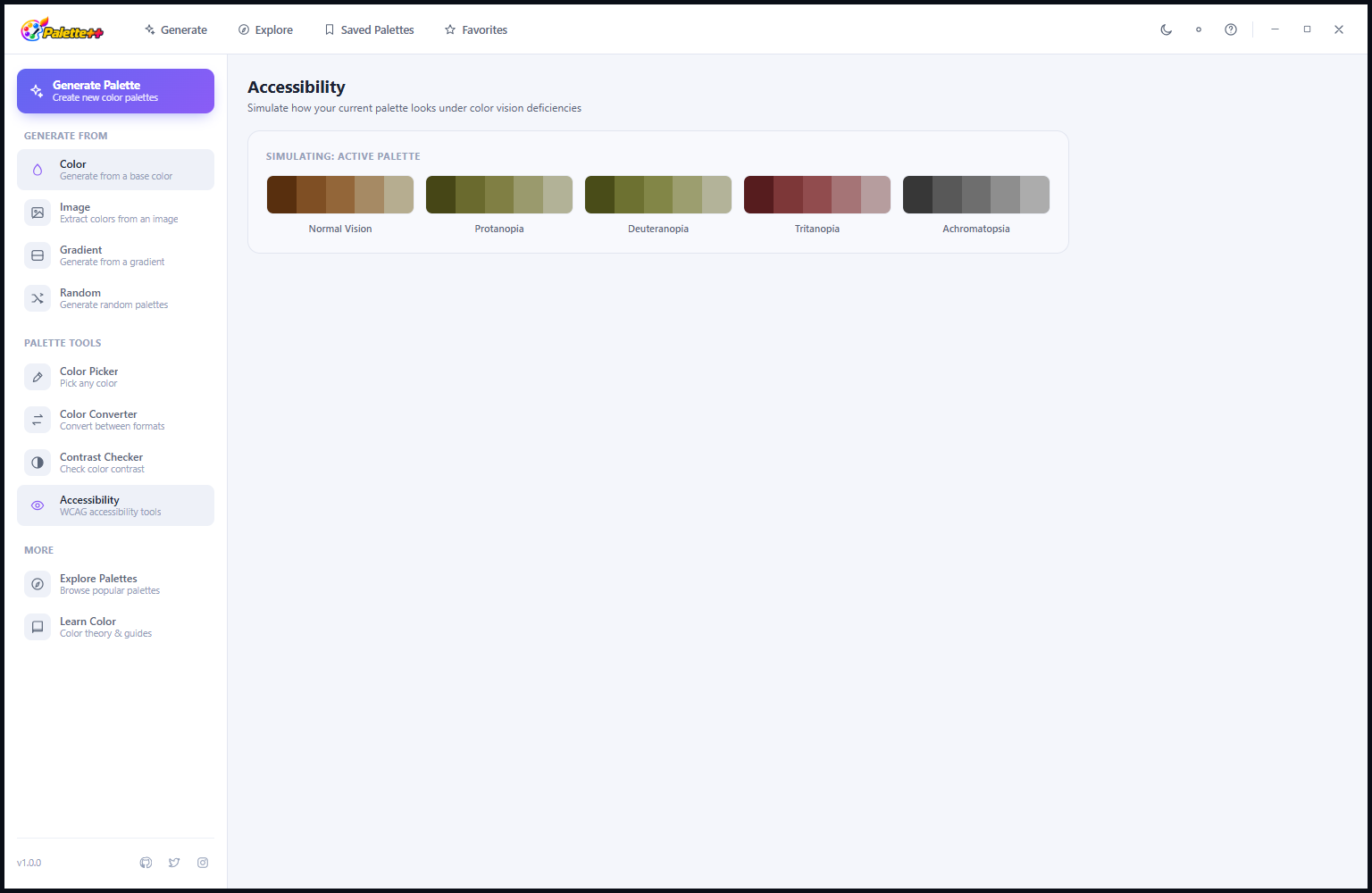
The Saved and Explore palette library in Light Mode presents the full palette card grid on a white background. The named palettes (Sunrise Coral, Deep Ocean, Neon Nights and others) are equally recognizable in both themes — the color swatches are the dominant visual element in every card, and the light background does not compete with the palette colors the way a dark background might with very dark palette swatches. Browsing the library in Light Mode gives the experience of looking at palette samples in a traditional design reference book — clean, clear, visually straightforward.
Contrast Checker — Light Mode
The Contrast Checker in Light Mode presents the WCAG compliance results on a white background, which is particularly appropriate for checking contrast for light-background interfaces. When you are designing a white-background website or app and need to verify that your text colors meet accessibility requirements on that white background, running the check in Light Mode gives the most contextually accurate preview of how the text will actually appear in the target interface. The contrast ratio, AA and AAA indicators and the preview text panel all function identically in both themes.
HarmMap — Light Mode
The HarmMap in Light Mode renders the color wheel on a white background, which makes the color wheel segments and the plotted palette points particularly crisp and easy to read. The geometric patterns formed by complementary, triadic and tetradic relationships stand out clearly against the light background. For users who prefer to learn and reference color theory in a light environment — matching the white-background textbooks and design references they use alongside Palette++ — the Light Mode HarmMap provides a consistent visual context for understanding harmony relationships.
Color Picker Screen Sampling — Light Mode
The screen color picker operates the same way in both themes — when activated, it samples from the actual screen pixels regardless of Palette++’s own background color. In Light Mode, the activation button and the resulting color display are presented on the clean white background, but the sampling itself captures whatever color is under the cursor on the screen. This means the Light Mode interface is just as capable of sampling from dark-background websites or dark design files as the dark mode interface — the theme choice affects only how Palette++ looks, not what it can capture.
Additional Tools — Light Mode
All remaining sections of Palette++ — Settings, the complete Learn Color reference, any additional tools and preferences panels — present in the same clean Light Mode styling. The transition from dark to light mode is a single toggle in Settings that instantly refreshes the entire application interface. Your palettes, favorites, color history and settings are preserved across theme changes — switching themes is a display preference, not a mode that affects your saved data or tool configuration.
About and Help — Light Mode
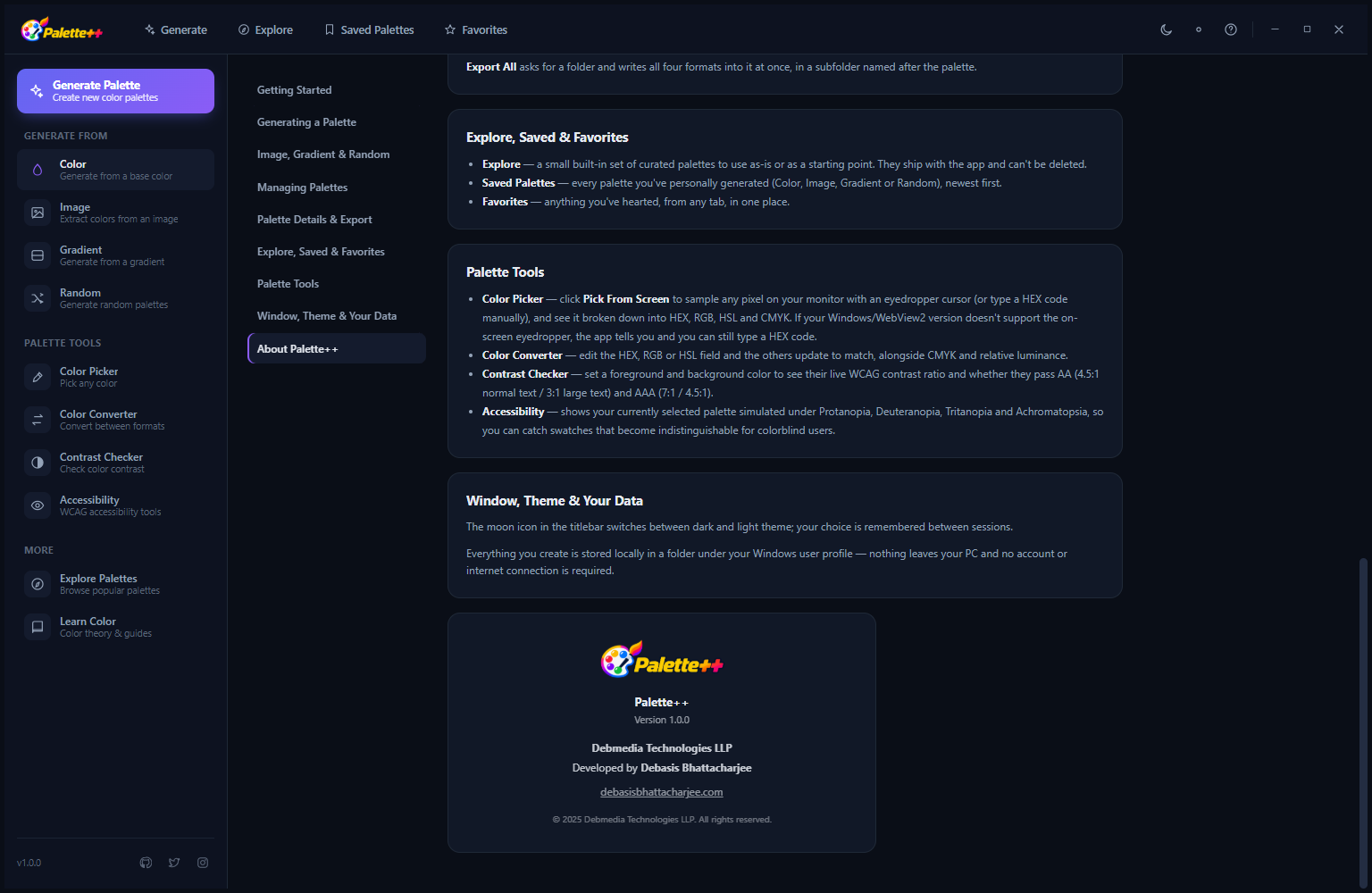
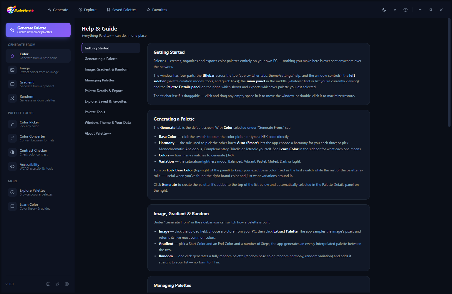
The About and Help page in Light Mode provides a complete reference for Palette++ features and data management. The Export All function allows exporting your entire saved palette collection as a single archive file — useful for backing up your library or transferring it to another machine. The Explore, Saved and Favorites sections are explained with usage guidance. The Windows/Theme/Data section explains how the light and dark themes work and where application data is stored. Version information and developer attribution (Debasis Bhattacharjee, Debmedia Technologies LLP) complete the page.
Who Is Palette++ For?
- UI and UX designers — Generate color palettes based on classical harmony rules, verify that text color choices meet WCAG accessibility contrast requirements, and use the screen color picker to sample colors from any source visible on your Windows display.
- Web and app developers — Copy color values in HEX, RGB or CSS formats directly from the color picker, check contrast ratios for accessibility compliance before committing to a color combination, and export palette colors as JSON or CSS variables for direct use in code.
- Graphic and brand designers — Build cohesive brand palettes from a base color, compare harmony variations simultaneously, and maintain a saved library of approved brand palettes for reference across projects.
- Content creators and illustrators — Explore the curated palette library to find inspiration for digital illustrations, social media graphics and video thumbnails, and use the color picker to match colors from reference images.
- Students learning color theory — Use the HarmMap visualization and the Learn Color reference section to build an intuitive understanding of how harmony rules work through interactive experimentation with real palette generation.
System Requirements
- Operating System: Windows 10 (64-bit) or Windows 11
- Processor: Any modern x64 processor
- RAM: 4 GB minimum
- Storage: 100 MB for the application
- Display: 1280 × 720 minimum — 1920 × 1080 recommended for the HarmMap color wheel view
- Runtime: .NET Desktop Runtime 6.0 or later (included in the installer if not present)
- Internet: Not required — fully offline
Frequently Asked Questions
Can I use the color picker to sample colors from any application on my screen?
Yes. The screen color picker (Pick Page Device) activates a system-level pixel sampler that can capture the color value of any pixel visible anywhere on your Windows display — including colors in other applications, web browsers, images, design tools and video players. The captured color is immediately available in all four formats (HEX, RGB, HCL and CMYK) for copying and use in any project.
What WCAG level does the contrast checker evaluate?
The Contrast Checker evaluates both WCAG 2.1 AA and AAA compliance for both normal text (below 18pt or 14pt bold) and large text (18pt and above, or 14pt bold and above). The required ratios are: AA requires 4.5:1 for normal text and 3:1 for large text; AAA requires 7:1 for normal text and 4.5:1 for large text. All four pass/fail results are shown simultaneously so you can see which combinations meet which accessibility levels.
Can I export my saved palettes to use in other applications?
Yes. Individual palettes can be exported as PNG (an image of the color swatches with HEX labels), SVG (scalable vector format), JSON (a structured data file with all color values) or CSS variables (a stylesheet you can import directly into a web project). The Export All function on the About page exports your entire saved collection as an archive for backup or migration purposes.
Does switching between Dark Mode and Light Mode affect my saved data?
No. The theme mode is purely a display preference. All saved palettes, favorites, color history and settings are fully preserved when you switch themes. You can switch between dark and light mode freely at any time without any effect on your data.
The Color Design Tool That Stays With You Through the Entire Creative Process
Palette++ is built for the reality of how designers and developers actually work with color: starting with a vague idea, generating options based on harmony principles, exploring curated references for inspiration, picking exact colors from existing sources with the screen sampler, verifying contrast for accessibility, and maintaining a personal library of approved palettes to return to across projects. All four of those workflows are in one application, running offline, with no subscription and no data leaving your machine. Whether you are creating a complete brand identity or just checking whether your button text meets WCAG AA, Palette++ is the tool already open on your second monitor.
Download Palette++ today — free to install, works completely offline, and comes with a curated palette library ready to explore the moment it opens.
Download Palette++
Generate, explore and export beautiful color palettes for designers and developers