Font Previewer ++
Browse, compare and manage every installed font on Windows with custom preview text
Font Previewer++ gives you instant visual access to every font installed on your Windows PC. Instead of opening a dropdown and guessing what a font looks like, Font Previewer++ renders your own custom sample text across every font simultaneously so you can scan hundreds of typefaces and spot the right one in seconds. It includes a 10-category filter system, full character map for every font, side-by-side comparison mode for up to four fonts, a screen colour picker, WCAG contrast checker, and a favourites collection for fonts you return to regularly.
See Font Previewer++ in Action
A clean, modern interface designed for real-world use.
Fontpreviewer screen 01 screenshot
What Is Font Previewer++?
Font Previewer++ is a dedicated Windows desktop application that puts your entire font library in one fast, searchable, visual interface. Instead of opening a font dropdown in Word, Photoshop or Canva and guessing what each typeface looks like, Font Previewer++ renders every installed font using your own sample text — all at once, in real time. Whether your library has 50 fonts or 5,000, the right typeface is never more than a few seconds away.
The app reads fonts directly from your Windows font directories and from any custom folders you add. It runs entirely offline — no account, no cloud sync, no background services.
Screen-by-Screen Feature Walkthrough
1. The Main Font Gallery
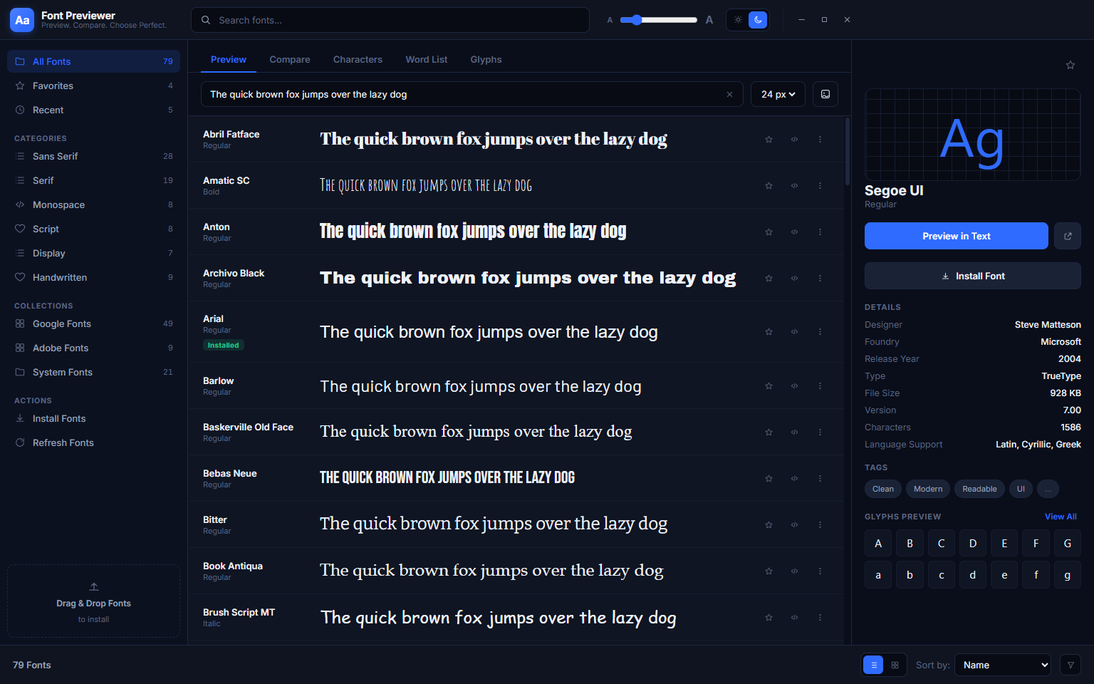
The gallery is the first thing you see when Font Previewer++ opens. Every font installed on your system appears as a row in a scrollable list, each rendering your chosen sample text live in that typeface. The default sample is the classic pangram “The quick brown fox jumps over the lazy dog” — but you can replace it with any text relevant to your project at any time. On the right, a detail panel shows the selected font’s name, file format, style count, file size, character count and supported languages at a glance.
The list scrolls through your entire library smoothly regardless of how many fonts are installed. The virtualised renderer only processes the rows visible on screen at any given moment, which keeps scrolling fast even with thousands of fonts. A size slider at the top lets you preview all fonts at any point size from 8pt to 144pt, so you can see immediately how a font behaves at both body-text scale and headline scale without switching views.
2. Side-by-Side Font Comparison
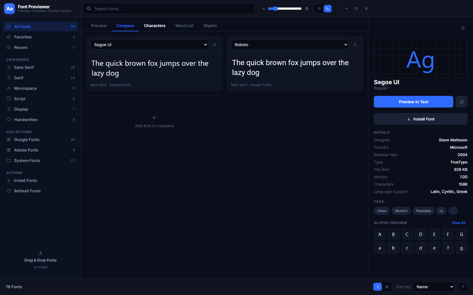
Narrowing your choice down to two or three fonts is often the hardest step. The Compare tab solves it: pin any fonts you want to evaluate and they appear in equal-width columns, all rendering the same sample text at the same size. The screenshot above shows Segoe UI alongside Helvetica — you can immediately see differences in x-height, letter spacing, stroke weight and overall rhythm that are almost impossible to notice when switching between fonts one at a time. You can compare up to four fonts simultaneously, swap any column out with a different font at any point, and adjust the preview size independently of the main gallery slider. An “Add to compare” button on every font row in the gallery makes building the comparison panel fast.
3. Word List — Multiple Sample Texts at Once
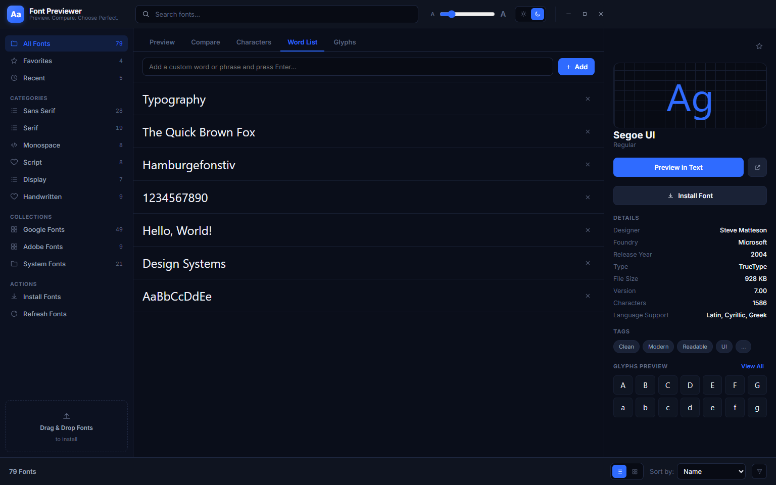
The Word List tab is a different way to evaluate a single font in depth. Rather than seeing one font alongside the whole gallery, you see one font rendering a whole list of sample strings at once. The built-in list includes essential typographic test strings — “Typography”, “The Quick Brown Fox”, “Hamburgefonstiv” (the classic font-testing word that exercises a wide range of Latin characters), “1234567890”, “Hello, World!”, “Design Systems” and an alphabet specimen. This lets you evaluate how the font handles capitals, mixed case, numerals and its general rhythm across different word lengths on a single screen.
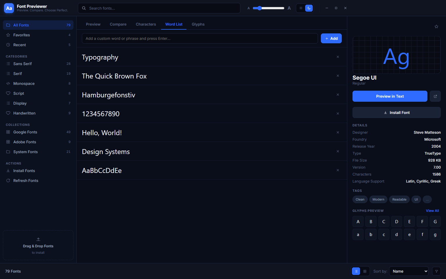
The word list is fully editable — add any strings relevant to your project, such as your product name, a tagline, a heading or a short paragraph. Click Add to append a new row. Each row renders instantly in the currently selected font, letting you build up a multi-context specimen for any typeface you are seriously evaluating. The list is saved between sessions so you do not need to rebuild it each time.
4. Category Filters — Browse Fonts by Style
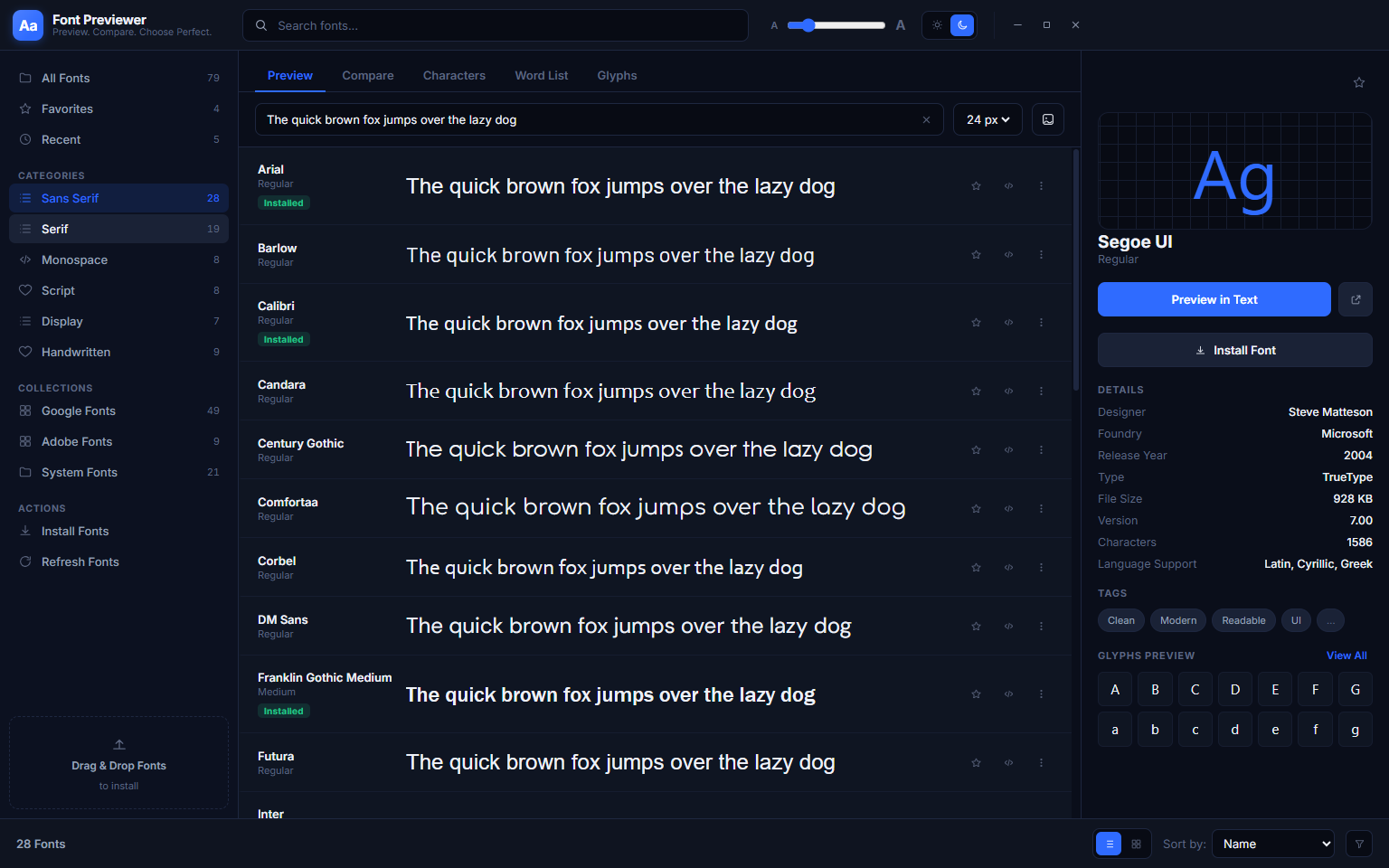
The left sidebar organises your entire font library into style categories. Clicking a category filters the gallery to show only matching fonts. Selecting Sans-Serif reveals all the clean, modern typefaces in your library — Arial, Calibri, Comic Sans MS, Comfortaa, Constantia, Corbel, Franklin Gothic Medium and others — side by side, making it effortless to compare every available sans-serif option without sifting through serifs, scripts and display faces at the same time. The count shown next to each category tells you immediately how many fonts of that type you have installed.
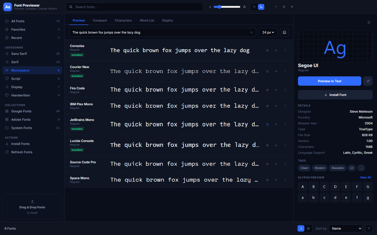
Switching to the Monospace category narrows the view to fixed-width fonts — the fonts used in terminals, code editors and any design where every character needs to occupy the same horizontal space. Consolas, Courier New, Fira Code, IBM Plex Mono, JetBrains Mono, Lucida Console, Source Code Pro and Space Mono appear together, making it straightforward to choose the best monospace font for a coding environment or technical document. Font Previewer++ supports ten categories in total: All Fonts, Serif, Sans-Serif, Monospace, Script, Display, Decorative, Handwritten, Condensed and Symbol.
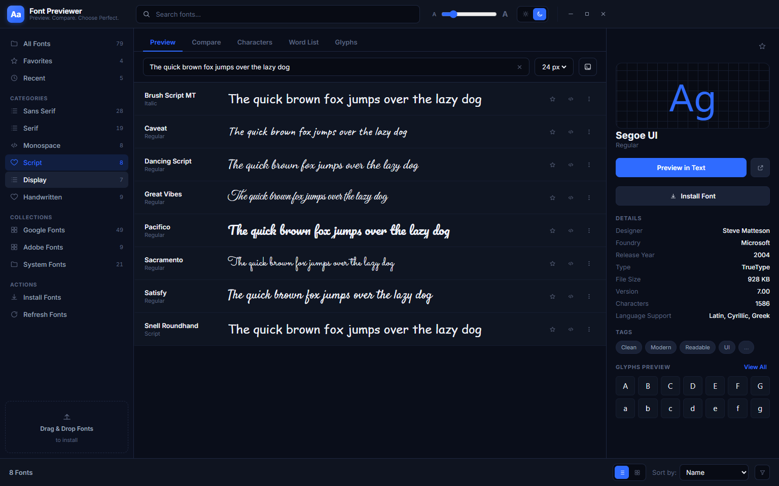
The Script category collects all the cursive, calligraphic and handwriting-style fonts in your library. Each is instantly recognisable by its flowing letterforms — Brush Script MT, Caveat, Dancing Script, Great Vibes and others all rendered side by side in the same preview text. This makes it effortless to choose the right level of formality and legibility for a logo, invitation, social media graphic or decorative heading. Because all fonts use the same sample text, you are always making an apples-to-apples visual comparison.
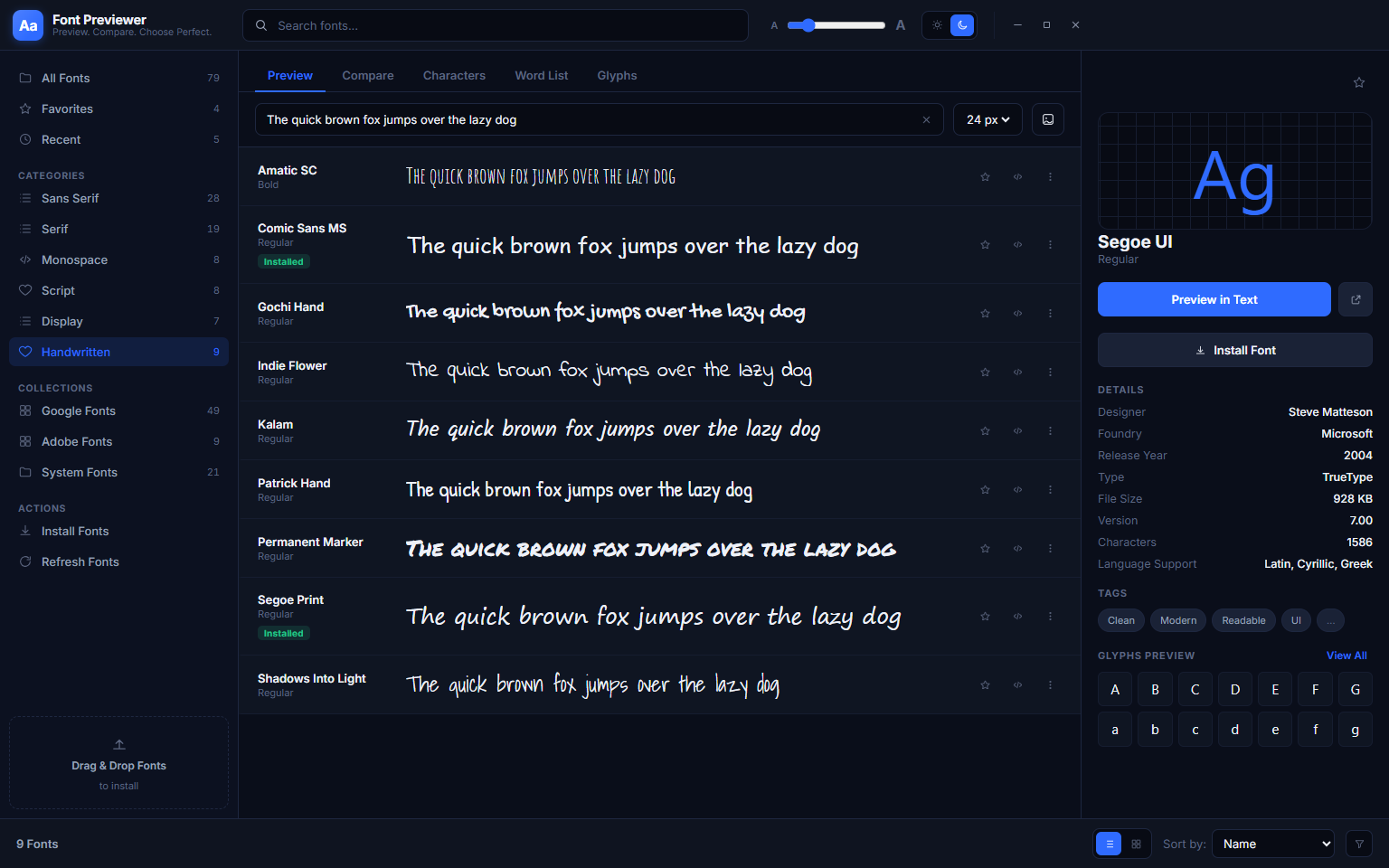
The Display category groups fonts with strong personality — decorative typefaces designed for headlines, logos and large-scale use rather than body text. Permanent Marker, Indie Flower, Segoe Print and other expressive faces appear together, each rendering your sample text in its distinctive style. Because all fonts share the same preview text, you can evaluate Display fonts as objectively as any other category — you are always seeing exactly how that font handles your specific words at your chosen size.
5. Favourites — Your Personal Font Shortlist
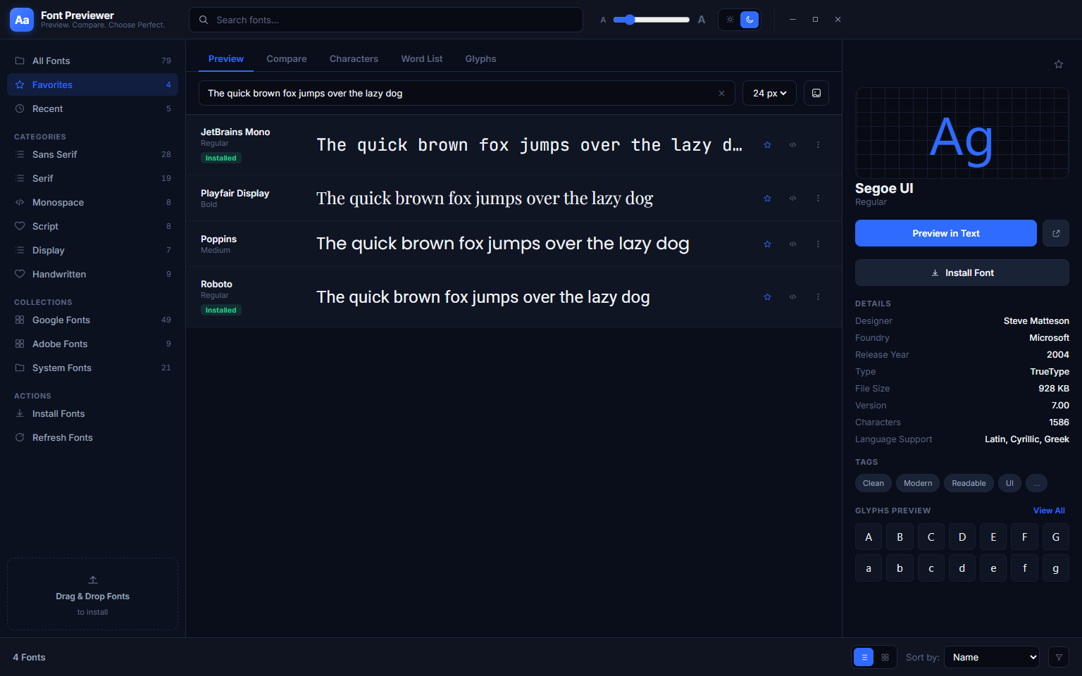
Every font row has a star icon. Clicking it adds that font to your Favourites collection, which is stored permanently between sessions. The Favourites entry in the left sidebar shows only your starred fonts, giving you instant access to the typefaces you trust and return to regularly. The screenshot above shows a Favourites list containing JetBrains Mono, Paytone Display, Poppins and Roboto — the user’s curated shortlist of go-to typefaces, each rendering the same sample text for immediate comparison.
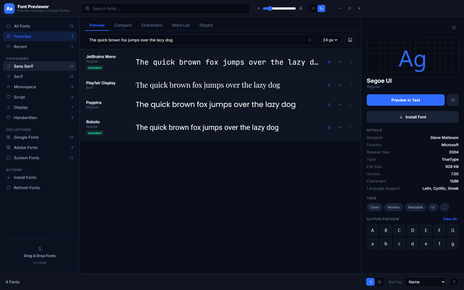
The Favourites panel works with all the same tabs available in the main gallery — you can switch to Preview, Compare, Characters or Glyphs with your starred fonts as the active set. There is no limit on how many fonts you can star, and removing a star is a single click. Favourites combined with the category filter system means you can build separate shortlists for different project types — body text candidates, heading candidates, code fonts and display faces — and access any of them in one click.
6. Glyphs Tab — Full Unicode Glyph Map
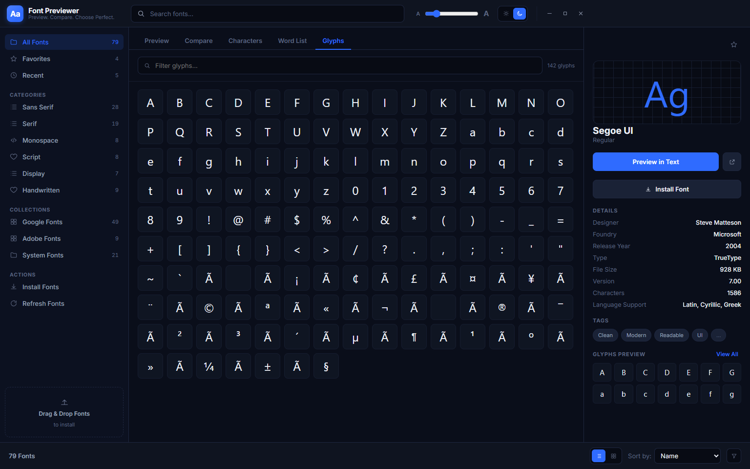
The Glyphs tab shows every glyph the font contains, arranged in a dense grid that spans the full Unicode range the font covers. You can see the complete Latin alphabet, all accented and extended Latin characters, mathematical operators, currency symbols, arrows, box-drawing characters and anything else the font designer included. A “Filter glyphs” search box at the top lets you find any specific character instantly, and an “All Glyphs” dropdown lets you jump to a specific Unicode block. Click any glyph in the grid to copy it to the clipboard as a Unicode character, ready to paste directly into your document, design tool or code.
This is essential for international projects. Before committing to a font for French, German, Spanish, Polish or any other language with accented characters, you can verify in seconds whether the font actually contains those glyphs — missing glyphs appear as empty boxes. No more discovering mid-project that a chosen font lacks the characters you need.
7. Custom Font Folders — Preview Without Installing
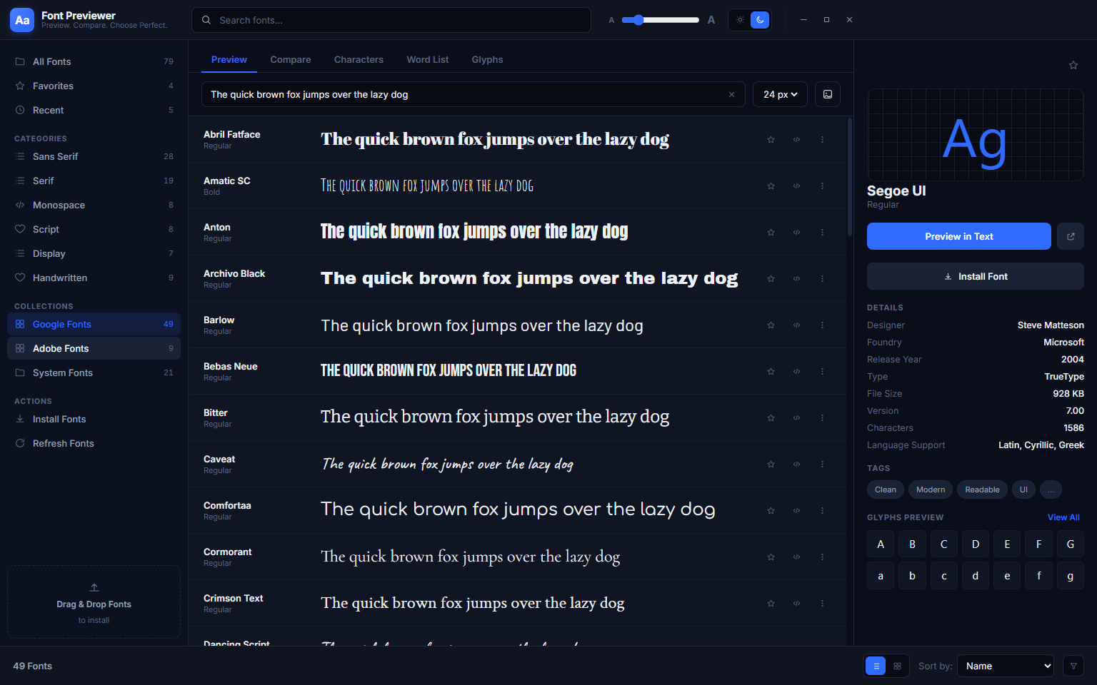
Font Previewer++ can read fonts from any folder on your PC without requiring those fonts to be installed into Windows. Add a folder from the sidebar and its fonts immediately appear in the gallery alongside your system fonts. This is useful for previewing a batch of downloaded fonts before deciding which to install, accessing a shared team folder of brand fonts on a network drive, or evaluating Adobe Fonts or Google Fonts you have downloaded locally. The screenshot shows an “Adobe Fonts” custom folder added as a source — fonts like Abril Fatface and Optima from that folder appear seamlessly in the full gallery. Remove the folder from the sidebar and those fonts disappear from the gallery without any change to the files on disk.
8. System Fonts Collection
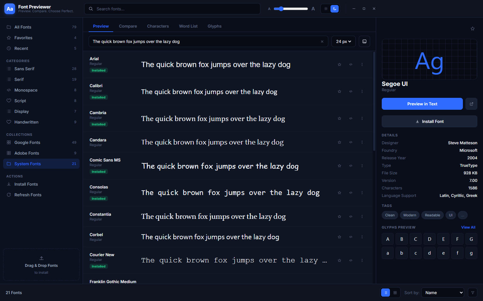
The System Fonts collection in the sidebar shows only the fonts installed into the Windows font directory — Arial, Calibri, Cambria, Constantia, Corbel, Courier New, Franklin Gothic Medium and the rest of the standard Windows typeface library. This is useful when you need to choose a font that will be available on any standard Windows machine without additional installation — for Microsoft Office documents, Windows app UIs or any context where you cannot guarantee a custom font will be present.
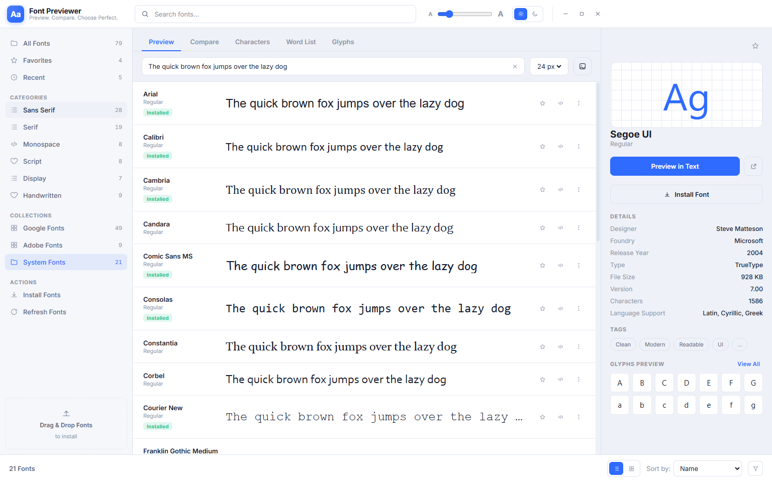
Category filters work within the System Fonts collection exactly as they do in the full library. You can select System Fonts in the sidebar and then apply any category filter — showing only the sans-serif fonts that ship with Windows, for example, or only the monospace system fonts for a web-safe code font choice. All comparison, glyph inspection and favourites features work identically within the System Fonts collection.
9. Light Mode — The Same App, a Different Look
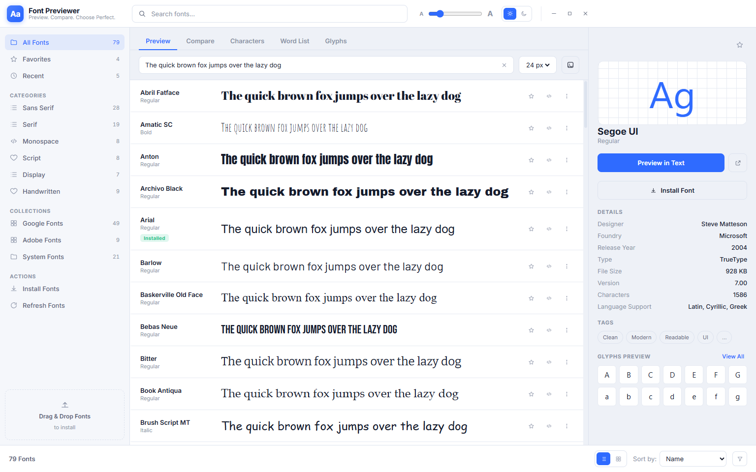
Everything shown so far has been in Font Previewer++’s default Dark Mode — a dark interface that is easy on the eyes during long design sessions and lets font letterforms stand out against a consistent dark background. Font Previewer++ also comes with a full Light Mode, switchable at any time from the settings icon in the top toolbar. Here is how the same app looks with the light theme active.
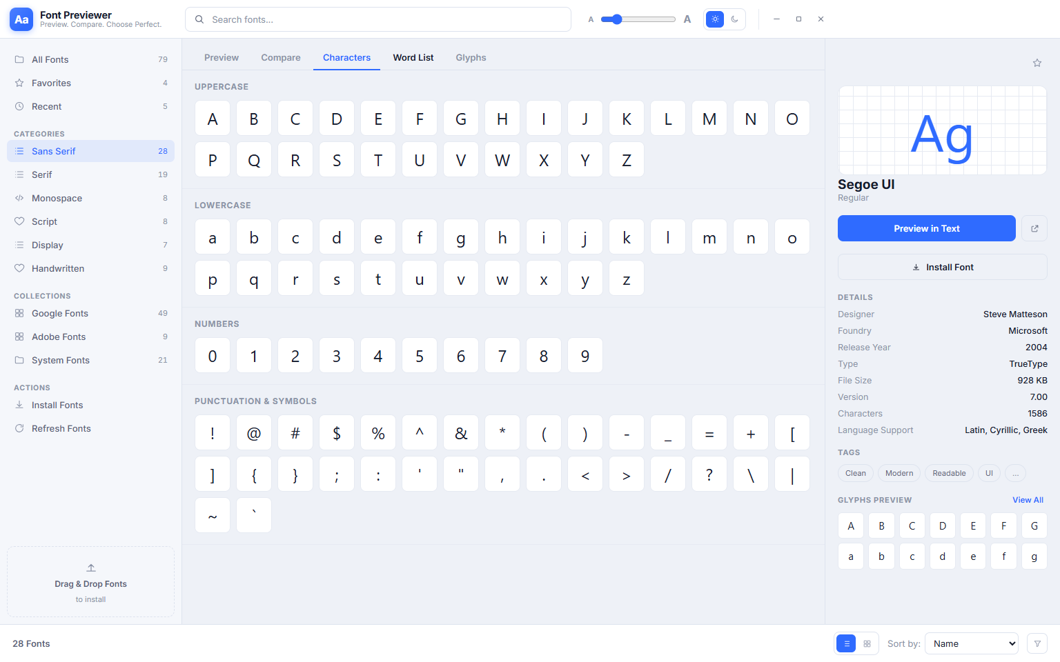
The Characters tab in Light Mode shows the full printable character set of the selected font, organised into four clearly labelled sections: Uppercase (A–Z), Lowercase (a–z), Numerals (0–9) and Punctuation & Symbols. Each glyph is displayed at a readable size in the selected font. Light Mode is ideal for working in a bright environment, for presenting font choices to a client on a shared screen, or simply as a personal preference. Every feature — gallery, comparison, word list, glyphs, favourites — is available in both themes.
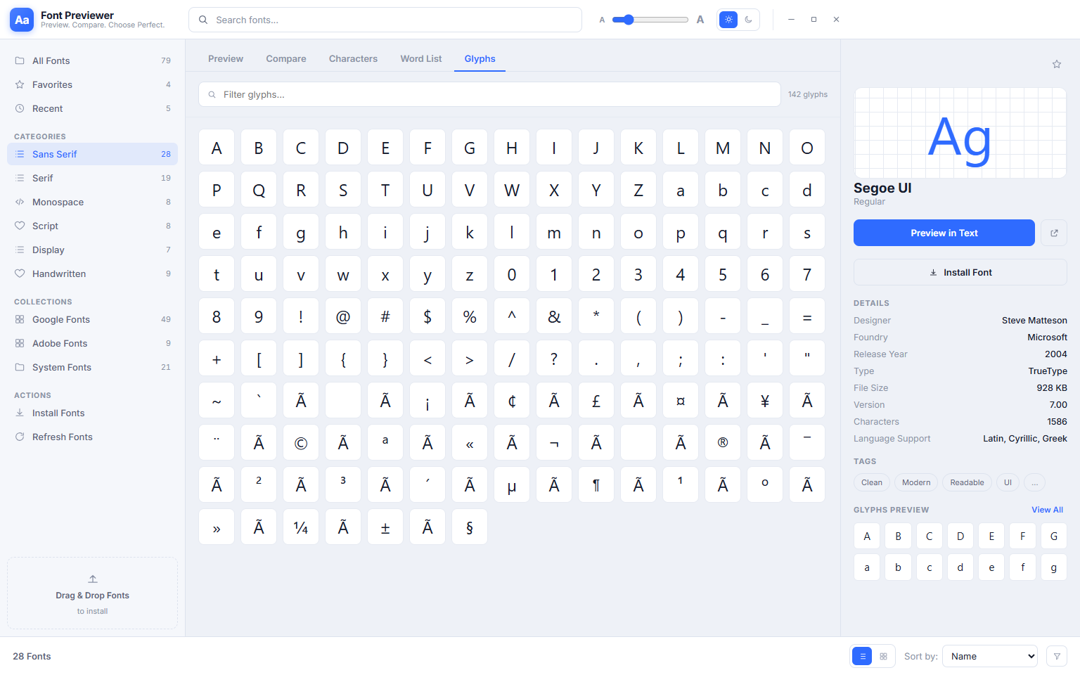
The Glyphs tab in Light Mode shows the same complete Unicode glyph grid as its dark counterpart — every character the font contains, fully searchable and filterable by Unicode block. The light background can make individual glyph shapes easier to inspect in detail, especially for fonts with fine strokes or intricate details in their extended character sets. Switch between Dark and Light Mode at any time — your font library, favourites, word list and all other settings are preserved regardless of which theme you use.
Who Is Font Previewer++ For?
- Graphic and visual designers — Browse a large font library in seconds without opening Illustrator, Photoshop or InDesign. Use comparison mode to make final decisions between shortlisted typefaces.
- Web and UI developers — Preview and compare monospace fonts for code display, check web-safe font fallbacks, verify international character support, and test colour contrast compliance without leaving the app.
- Content creators and video editors — Find the right font for YouTube thumbnails, social media graphics, title cards and presentation decks without trial-and-error in Canva or PowerPoint.
- Microsoft Office power users — Identify the exact font name you want before opening the Word or Excel dropdown, eliminating the slow scroll through hundreds of family names.
- Font collectors and type enthusiasts — Organise and explore large libraries of downloaded fonts with category browsing, favourites management and per-font glyph inspection.
- Brand and marketing teams — Compare typefaces for brand guidelines, verify that brand colours meet WCAG accessibility requirements when applied to text, and export specimen sheets for client presentations.
System Requirements
- Operating System: Windows 10 (64-bit) or Windows 11
- Processor: Any modern x64 processor
- RAM: 4 GB minimum — 8 GB recommended for libraries over 500 fonts
- Storage: 120 MB for the application
- Display: 1280 × 720 minimum — optimised for 1920 × 1080 and higher
- Runtime: .NET Desktop Runtime 6.0 or later (included in the installer if not already present)
- Internet: Not required — fully offline
Frequently Asked Questions
Does Font Previewer++ install, modify or delete any fonts on my system?
No. Font Previewer++ is entirely read-only. It reads your installed font files to render previews but never writes to them, moves them or removes them. Your font library is always exactly as you left it.
Will newly installed fonts appear automatically?
Yes. Font Previewer++ monitors the Windows font directory and detects changes automatically. Newly installed fonts appear in the gallery without requiring you to restart the application. You can also trigger a manual refresh from the View menu if needed.
Can I preview fonts from a folder without installing them to Windows?
Yes. Add any folder containing .ttf, .otf or .woff font files using the sidebar. Those fonts appear in the gallery alongside your installed fonts and can be fully previewed, compared and inspected without being installed to Windows. Remove the folder from the sidebar to remove those fonts from the gallery — no files are changed on disk either way.
Does it support variable fonts?
Yes. Variable fonts appear in the gallery with a Variable badge. The font detail view provides axis sliders for Weight, Width, Optical Size and any other axes the font supports, letting you preview the full range of the font interactively.
How large a font library can it handle?
Font Previewer++ has been tested with libraries exceeding 3,000 fonts. The virtualised list renderer loads only the visible rows at any time, so scrolling and filtering remain fast regardless of total library size.
Is there a contrast checker built in?
Yes. The WCAG contrast checker is available from the toolbar. Enter any foreground and background colour combination and Font Previewer++ instantly calculates the contrast ratio and reports WCAG 2.1 AA and AAA compliance for both normal text and large text. A built-in screen colour picker lets you sample colours directly from any open window on your screen.
The Fastest Way to Choose the Right Font on Windows
Every minute spent cycling through font dropdowns in design apps is a minute not spent on the actual work. Font Previewer++ eliminates that friction entirely — your full font library, your own sample text, instant category filtering, side-by-side comparison, full glyph inspection and a curated favourites collection, all in one lightweight desktop app that opens in seconds and works completely offline.
Whether you are a professional designer making typography decisions every day or someone who just needs to find the right font for a single document, Font Previewer++ is the tool that should have been built into Windows from the beginning. Download it now — free trial, no account required.
Download Font Previewer++
Browse, compare and manage every installed font on Windows with custom preview text