To design a responsive CSS API, I would leverage CSS Grid and Flexbox for layout adjustments while ensuring media queries adapt styles for different screen sizes. Additionally, I would utilize…
Tag
#responsive-design
How do you design a responsive CSS API that accommodates different screen sizes and maintains accessibility standards?
🏷️
How would you approach designing a responsive UI using CSS3 to ensure optimal performance across various devices and screen sizes?
To design a responsive UI using CSS3, I would utilize fluid grid layouts, media queries, and flexible images. By applying a mobile-first approach, I ensure that styles are optimized for…
🏷️
Can you explain how CSS3 Flexbox works and how it can be used to create responsive layouts?
CSS3 Flexbox is a layout model that allows for the easy arrangement of elements in a one-dimensional space. It helps in creating responsive layouts by enabling items to grow, shrink,…
🏷️
Can you explain the CSS3 Flexbox layout model and how it differs from traditional box models when handling responsive design?
Flexbox is a one-dimensional layout model that allows for responsive arrangement of items within a container. Unlike traditional box models that rely on static widths and heights, Flexbox enables dynamic…
🏷️
Can you describe a situation where you had to troubleshoot a CSS issue in a project? What steps did you take to resolve it?
In a recent project, I encountered an issue where the layout of a page was broken in certain browsers. I used the developer tools to inspect the elements, identify conflicting…
🏷️
Can you explain how box model properties in CSS3 impact layout and design decisions?
The CSS box model consists of margins, borders, padding, and the content area. Understanding how these properties interact is crucial for proper element spacing and layout in design. It allows…
🏷️
Can you explain how Tailwind CSS handles responsive design and what classes you would use to implement it?
Tailwind CSS handles responsive design through a mobile-first approach using responsive utility classes. You can prefix your classes with breakpoints like ‘sm:’, ‘md:’, ‘lg:’, or ‘xl:’ to apply styles at…
🏷️
Can you explain how to use SCSS mixins for responsive design and give an example of a scenario where they improve maintainability?
SCSS mixins allow you to encapsulate CSS properties and values, making it easy to apply styles across different breakpoints. For responsive design, you can create mixins that define media queries…
🏷️
Can you explain how CSS3 Flexbox works and discuss its advantages over traditional CSS layouts?
CSS3 Flexbox is a layout model that allows for responsive design by distributing space along a single axis. Its advantages include easier alignment of items, better control over item sizes,…
🏷️
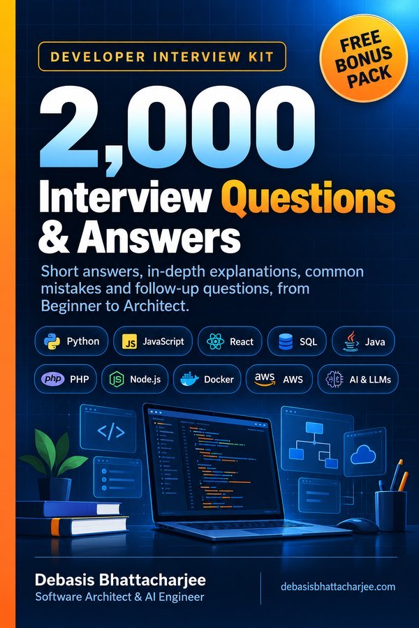
Developer Interview Kit · PDF

2,000 Interview Questions & Answers, in one PDF
- Short answers, in-depth explanations, common mistakes and follow-ups
- 89 topics, from Beginner to Architect, with a clickable contents list
- 226 extra questions that are not on this website
- Free Bonus Pack: 30-day study plan, behavioral questions, salary scripts
$7.99 one-time · instant email delivery
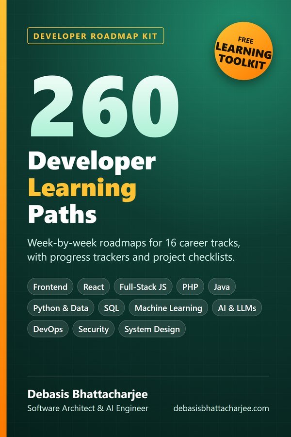
Also available: 260 Developer Learning Paths $4.99
Week-by-week roadmaps for 16 career tracks (Python, React, Java, DevOps, SQL, AI and more), with a progress tracker on every path.
See what's inside →
Get both books for $9.99 (save $2.99):
The material stays free to read online. This is the organised, offline, print-ready PDF edition. Secure payment by PayPal; your personal download link is emailed after payment is confirmed. Digital product, no shipping.