In Tailwind CSS, responsive design is managed using breakpoint modifiers. You append a prefix like ‘sm:’, ‘md:’, or ‘lg:’ to utility classes to apply styles at specific screen sizes.
Tag
#front-end
How do you manage responsive design in Tailwind CSS?
🏷️
Can you explain how CSS3 Flexbox works and how it can be used to create responsive layouts?
CSS3 Flexbox is a layout model that allows for the easy arrangement of elements in a one-dimensional space. It helps in creating responsive layouts by enabling items to grow, shrink,…
🏷️
Can you explain what an Angular component is and its role within an Angular application?
An Angular component is a building block of an Angular application that controls a part of the user interface. It consists of a TypeScript class, an HTML template, and a…
🏷️
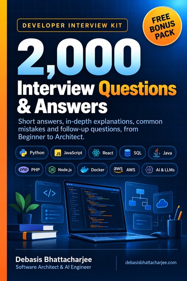
Developer Interview Kit · PDF

2,000 Interview Questions & Answers, in one PDF
- Short answers, in-depth explanations, common mistakes and follow-ups
- 89 topics, from Beginner to Architect, with a clickable contents list
- 226 extra questions that are not on this website
- Free Bonus Pack: 30-day study plan, behavioral questions, salary scripts
$7.99 one-time · instant email delivery

Also available: 260 Developer Learning Paths $4.99
Week-by-week roadmaps for 16 career tracks (Python, React, Java, DevOps, SQL, AI and more), with a progress tracker on every path.
See what's inside →
Get both books for $9.99 (save $2.99):
The material stays free to read online. This is the organised, offline, print-ready PDF edition. Secure payment by PayPal; your personal download link is emailed after payment is confirmed. Digital product, no shipping.